Illustration & Visual Narrative
Week 1 (27th August 2021)- Week 5 (24th September 2021)
Jodiann Yeoh Chooi Kit 0352238
Illustration & Visual Narrative || Project 1

Lectures
Week 1(Introduction & Briefing)
Week 1(27/8/2021) consisted of a warm introduction of what
illustration is about and the briefing of the Module Information
Booklet, Rubric, Assignment Briefs and Tracker, and e-portfolio set
up guide, to ensure that we are clear on the contents and what's
needed to be done to achieve a satisfactory grading through the
credit system and the minimum credits needed to move forward. Ms.
Anis alongside with Ms. Jennifer explained to us how this module
would be highly applicable and useful to a wide range of fields and
how it would assist us in the future. I am certainly looking forward to my journey & progression on illustration
and visual narrative.
Week 2(Character Design)
Week 2(3/9/2021) started off with a tutorial by Ms. Jennifer, on
the basics and guidance on how to create the Vormator Characters in
the trusty Adobe Illustrator. She first walked through the tools,
cursers, control panels for every particular tool you select like
opacity, stroke etc. , the layers tab, appearance and variables tab
and much more which she stated would take some time to go through
but eventually get the hang of with more practice. She then showed
us her human-like cartoon caricature of an adorable chameleon that
she made prior to class, with referencing images taken from
Pinterest/ Google, as well as the Vormator shapes that she used.
After that, she used the bezier tool, a tool which we had be
practicing with in digital photography and imaging module as well as
how to use the symmetry tool to create the shapes(touching on Design
Principles module of Law of Symmetry Gestalt Theory). After creating
the shapes using the bezier tool, she proceeded to place it step by
step till it resembled a chameleon. The end result did not entirely
resemble her caricature, and tweaked it to look better than it
actually did which was all part of the process.

Fig 1. Ms Jennifer's demonstration 3/9/2021

Fig 1.1 Ms Jennifers end result of demonstration 3/9/2021
Ms. Noranis explained the principles of character design which
includes their shapes, colour, emphasis & contrast, harmony,
expression and poses which played a huge role in how a character is
viewed. We were then asked what our favourite cartoon characters/
shows are. I shared that mine was adventure time and how Jake was my
fav character as he has a lively and bombastic
personality.

Fig 1.2 Basic shapes of characters from "Alladin" taken from the
lecture slides 3/9/2021

Fig 1.3 Colour study from lecture slides 3/9/2021
She explained how characters follow these sets of colour rules
which makes it appealing to viewers eyes, thus why we are so
captivated them as it reflects the personality of the character
itself. For example, dark colours which are associated to evil and
bright, vibrant colours used to express carefreeness and
positivity.
Week 3(Character Design)
For this week, the lecture started off with Ms. Jennifer
demonstrating how to use the gradient tool and applying the
swatches, as well as the tools necessary in creating a background
for her completed Vormator character, Cammy. She explained the
appropriate dimensions needed for the layout of the game card in
Adobe Illustrator which is 897 X 1497 pix. She went through how to
adjust the transparency and opacity and how to use the layers. She
also used multiple tools as example like the knife tool to cut out
and delete any unwanted areas/ detailing. The pen tool can also be
utilised to add in more points in order to adjust in order to adjust
as needed. It was very helpful as I was quite overwhelmed and
unfamiliar with the tools on illustrator. At the end, we helped Ms
Jennifer decide on the powers and description of Cammy(on the game
card) which was fun.
After that, Ms. Noranis went on to explain about composition.
Aspects that were touched are what makes a composition of an image
stand out and the rules relevant to it. For example, a
balanced positive and negative space, visual hierarchy, positive
and negative value tones, a good sense of observation
etc. She also showed some examples of shots/ compositions like the
birds eye view, establishing, framing, medium shot, close up
etc.

Fig 2. Week 3 slide
Week 4 (Perspective)

Fig 2.1 What is Perspective?

Fig 2.2 Types of Perspectives

Fig 2.3 Different forms of grounds created by perspective -> depth
Week 5(Chiaroscuro)

Fig 2.4 What's Chiaroscuro?

Fig 2.5 Example of Chiaroscuro?

Fig 2.6 Why its used

Fig 2.7 Other uses
Instructions
We were shown the Assignment Brief of Task 1(Exercise 1) which is the "Vormator challenge" where we're
supposed to create a special character based on the limited
shapes that's provided as shown in Fig 1.2 below. We
were advised to draw a rough sketch of what the character would
look like in order to generate some possible character design
ideas to pick/ choose from as a final design.
Fig 3. Vormator Challenge Instructions
Fig 3.1 Vormator Shapes
Task 1 - Vormator Challenge
Ideas of what I want my vormator character to be:
-nudibranch
-nautilus
-octopus
-mushroom
Source of inspiration

Fig 3.2. Image of banana slug taken from Google
Fig 3.3. Dorid Nudibranch(Google)
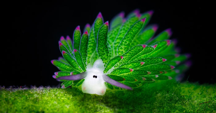
Fig 3.4 Costasiella kuroshime sheep nudibranch(Google)

Fig 3.5 Flabellina marcusorum nudibranch
Drafting

Fig 4. Draft of vormator characters based on referencing images
& vormator shapes provided.

Fig 4.1 Character outline indicators of vormator shapes used.

Fig 4.2 Render of my Vormator character
I had rot my digital sketches and renders on Sketchbook instead of Adobe illustrator due to ICT delaying it. For my character, I took inspiration from the colours of nudibranchs itself which is usually vibrant in colour and has little tentacle like protrusions from its body which is luminescent therefore I created that luminance effect.

Fig 4.4 Creating Vormator Character on Illustrator using render reference.
I found myself struggling to find the appropriate tools thus why it took so long to make it however at the end I got the hang of it after re-watching Ms. Jennifers recorded demonstration found on Times. I used my render as a reference for placement of the shapes and the reference images opacity was reduced to 50% to ensure that ill be able to see if the placement is appropriate(like how Ms Jennifer did).

Fig 4.5 Experimenting with tarot card surface design
I wanted to create a simple background so I made the base black, then applied a gradient of black and very dark green to look as though it is a mist or some sort of seaweed floating around. I then made the borders of the card white, much like what a tarot card design would look like.

Fig 4.6 Placement of Vormator Character on Tarot surface
Just to see if the size of my vormator character is appropriate/ in proportion and whether I'm happy with the size. If not, I adjusted it to my liking. I kept in mind that I will be putting words on the bottom, thus why the nudibranch does not look like its in the middle but slightly higher placed.

Fig 4.7 Background of Front Part of Tarot Card
I wanted to create an eye catching background, but not so eye catching that it becomes overwhelming therefore I ensured that theres sufficient negative spacing. I made sure that the colour of the coral did not blend in with the colour of the main focus, my character. I used the pen tool to create the shape of the coral and filled it with an orangey brown colour. Next, I applied gradients to each coral stalk with the shadow matching the background colour, thus making it look like its from a slight distance from the nudibranch. I then used the ellipse tool to individually create each yellow polyp on the surface of the coral to make it look rough and textured like what a natural coral would look like. I also added a gradient to it to make it seem like it glowing like little bulbs. I purposely used the "Herculean" font as it looked archaic which contributes to the image of a tarot card. I also used the Roman numerals LXIX as it is a common inclusion on the front and back of tarot cards. The same font is also applied to the title of the card which is "the sublime" meaning something unfathomable.

Fig 4.8 Experimenting with background of back part of tarot card design(flipped)
I took inspiration of the design from sea fan corals. Why I chose this is that I wanted to sick to the underwater theme. I chose to use a red blending with orange colour to emphasise on the vibrancy of the coral as opposed to the dark background therefore creating contrast. The drawing itself was done using the brush tool in illustrator itself and the duo-colour was made using the gradient tool which I place in the swatch section.

Fig 4.9 Idea of background of back part of tarot card design(flipped) with character description
I then added the description of my character, Mr. Toast using the same Herculean font which was from Illustrator. Was not very happy with how it looked as it was messy due to the focus of the description being disrupted by the design of the coral. The font type was also not appropriate as the font itself consisted of uppercase letters only, overall look was quite overwhelming to the eyes.

Fig 5. 1st attempt of back and front of Tarot card design of my vormator character.
After receiving feedback from Ms. Noranis and Ms. Jennifer(detailed feedback on feedback section), I went back to the drawing board and wanted to develop my idea further, and hopefully improve.

Fig 6. Final revised front


Fig 6.2 Final revised back after week 5 feedback


Fig 6.3 Arrangement/flow of card design
A clearer arrangement of colour flow and design. What I changed from the initial to present design was the colour scheme where I used a more transitioning colour from the darkness sea floor with sea sponges and corals to vibrant colours ending with baby blue which shows that its moving up to the surface. Through that journey, you see sea rocks/cliffs surrounding the view moving up to the clutters of the sea fans(different kind of coral) which contrasts with the vibrancy of the background.
My vormator character as well as the yellow polyps of the orange coral was given a glow effect to create a form of luminescence and the deep red sea sponges in the background was given a blur effect which made it look like its disappearing through the distance.
I changed up the font of the description which contained lower case letters to make it less overwhelming and removed the initial red coral with branching out roots to prevent it from obstructing the eye from reading the words so it was less messy. I also made sure it didn't touch the white borders, I also did the same with "The sublime" as per requested.
I feel like the landscape as well as the use of colours has improved throughout the progression. Also, there is now more depth and sense of perspective through the use of toning of colours and dynamic use of landscape.
Feedback
Week 2
Ms Noranis said great work and found the characters that I created
cute. Fellow zoom mates gave flattering feedback in the chat section
like "I view slugs differently now" and many more sweet
comments which really gave me that motivation to carry
on improving and doing what I do.
Week 3
After showing my complete render of Fig 4.2, Ms. Noranis and Jennifer said that though there really like my concept/ idea, everything had to be done on Adobe illustrator. So everything starting from 4.3 onwards were made in illustrator from scratch.
Week 4 17/9/2021
Ms Noranis and Ms Jennifer stated that "THE SUBLIME" and my characters description was almost touching the borders which is a "big no-no". They also said that the back of my tarot card's coral was not very well done and does not go with the uppercase font of the description therefore I had to switch it to lower case lettering or a different font. The also said that the back was quite messy.
Week 5
They feel that it is more appealing and that I've improved on my colour scheme and background. They did ask me to make the text arrangement to follow the shape of the surrounding rock. They also asked me to add in the same nudibranch on the bottom but smaller to use the space. After doing so, they were satisfied with the result and said it has improved and good job.
Reflection
Week 2
a) Experience - The Vormator Challenge was indeed quite
challenging because we were given a limited amount of shapes to
choose from to build our character from. However, it was fun and a
great practice to think creatively despite the limited
resources.
b) Observations - Ms. Noranis and Ms. Jennifer creates a positive
and fun environment which has a vibe that's lovely to work in,
especially when I feel like passing out that early in the
morning.
c) Findings - I found myself struggling to find ideas on what to
create according to the given shapes initially, but as I did my
research through inspiration from Pinterest and google &
incorporated ideas that I'm passionate about like beautiful sea
slugs, that's when I get into the rhythm of creating
something.
Week 3
I learnt that I should be more open and adventurous on trying out new programmes as stepping out of your comfort zone really makes you develop as a designer. I found myself learning more and gaining confidence as I familiarised myself with illustrator therefore I'm proud of what I ended up with.
Week 4
This weeks feedback was pretty brutal. I was overall mad at myself on how badly I did but I know its a part of the learning curve and part of getting better. Despite that, it pushes me to want to do better due to honest feedback.
Week 5
This weeks feedback was much better than last week. I felt that I was given the right push to improve on my work therefore is reflected in my final design. It was a challenging but fruitful experience.
Further Reading
Week 1
Graphic Storytelling and Visual Narrative by Will Eisner
2008

Will Eisner is one of the most influential comic artists of the
twentieth century who laid out the fundamentals of storytelling
and their application in the comic book and graphic novel. In a
work that will prove invaluable for comic artists and
filmmakers, Eisner reveals how to construct a story and the
basics of crafting a visual narrative. Filled with examples from
Eisner's work as well as that of artists like Art Spiegelman and
R. Crumb, this essential work covers everything from the fine
points of graphic storytelling to the big picture of the medium,
including how to combine words and images into seamless storytelling, wield images like narrative tools, master different types of comic book stories, write and illustrate effective dialogue & develop ideas that can be turned into dynamic stories.
Comments
Post a Comment