Design Principles
(Week 1-3)
Jodiann Yeoh Chooi Kit 0352238
Jodiann Yeoh Chooi Kit 0352238
Module : Design Principles
Task : Exercise 2

Week 1(24th August 2021)
The class started off casually with the introduction of the lecture, Ms.
Jinchi, as well as fellow mates attending the class, also, class/ common
ground rules were touched on which consisted of the intolerance of
plagiarism, the submission of assignments at a timely manner and ensuring
that our progression will be shown/ explained throughout each week to ensure
development in our designs, that we are on par and understanding of our new
found knowledge. We then went through the Module Information Booklet, which
contained the modules assessment structure & marking and how to achieve
them. Overall, it was a fun and straightforward session to begin
with.
1. a recap of the selected design principles
2. your design process:
- visual research
- idea exploration and description
- final outcome in PDF and short rationale
- feedback by lecturer
- reflection on the particular exercise
- idea exploration and description
- final outcome in PDF and short rationale
- feedback by lecturer
- reflection on the particular exercise
Exercise 1 : Contrast & Gestalt Theory
Contrast
Contrast, as Ms. JinChi explained in her recorded lecture 1.2 is the
"juxtaposition of strongly dissimilar elements. Without visual contrast,
visual experience would be monotonous. It provides visual interest,
emphasise a point and express content." The way I view "contrast" is
the conformity of two contradicting elements, to become a single
harmonious being. You hear that term being tossed around a lot, and theres reason for that. Contrast is one of the aspects of the
design/art world which deems to be important or even crucial for
its attraction. Some might think that two different
things wouldn't go well together, but it might surprise you that it is
actually the enhancer and its what makes the piece come together. It
creates a dramatic atmosphere which catches the public's attention for its
pop of colour and oddities. That is why it is used so prominent amongst
designers and artists.
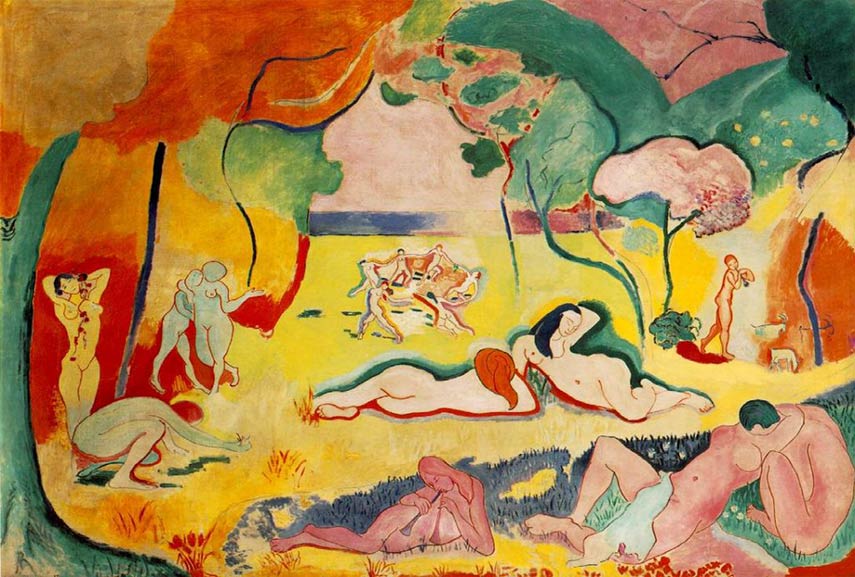
Fig 1. Henry Matisse - Joy of Life.
Contrast in art helps define the identity of the finished product. It
reflects the beliefs of the society during the time it was created, and from
the painting above, it contains a blend of contrasting colours, almost like
a dream world or even a fantasy. It also reminds me of the time God created
earth which proves how much art was heavily influenced by religion and how
the contemporary mix of colours, almost childlike, depicts the innocence of
the time before the forbidden apple was eaten.
Gestalt Theory
Gestalt's Theory is a Psychological based theory where principles of human's perception that describe how humans group similar
elements, recognise patterns and simplify complex images when we
perceive objects. It is a useful skill to organise content on
websites and other interfaces so it is aesthetically pleasing and easy to
understand. A single element is not only considered but rather of how
the totality is perceived by ones eyes.
The whole is other than the sum of the parts.
- Kurt Koffka
Thoughts - This quote speaks to me in the sense that what is being
depicted towards our eyes does not necessarily have to be rich in detail and contents to be able to view the picture as a
whole, nor does it restrict us from understanding its message and true
form.
Relevant Principles of the Gestalt Theory
Law of
Figure/ Ground

Fig 1.1 An Old Woman and A Young Lady
This Law is where people instinctively perceive objects as being in the
foreground or background. We are innately attracted to the stimulus,
which is the figure that captures our vision. This form of principle is
often applied in psychological tests to determine ones personality
according to what image we perceive. And in this case, we might have
seen either a young lady or a much older looking woman,
or something else even.
Principle of Closure

Fig 1.2
This principle is the way people tend to perceive incomplete figures as
complete by filling in the missing image's pattern in a cognitive manner/
in the brain. How we are able to do so is due to the simple idea that we
see such figures and shapes all around us so we are wired to naturally be
able to fill in the gaps of what's not there. The image above is an
example of such principle, despite having a missing figure in the middle,
it is quite obvious that it is a star shape due to the in-dents created
upon each circle.
The Law of Continuity
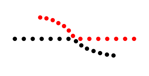
Fig 1.3
Suggests that we are more likely to perceive smooth flowing,
continuous lines rather than broken lines. This is an indicator that
we organise our perceptions into a cohesive object rather than a
series of objects/ parts.
The Principle of Similarity

Fig 1.4
Its how we group things visually, so things that look alike tend to
be mentally grouped together. For example, walking on the black part
rather than the whites of checkered tiles as it is "grouped"
differently in our minds.
The Principle of Proximity

Fig 1.5
The organisation of sensory stimuli into meaningful perception. It
asserts that things that are close to one another tend to be grouped
together and if not, it belongs to another group.
Law of Symmetry and Order
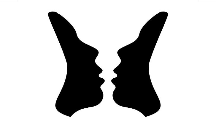
Fig 1.3
The perception that elements are seen as symmetrical shapes and therefore perceived as a unified group. For
example, the image below which was taken from google.
Exercise 1
Visual Research and Idea Exploration & Description

Fig 2. Dalmatian(Closure)
After I reading on Gestalt Theory, an immediate association to The
Principle of Closure came in mind. I thought of animals which I then
associated to black and white patterns or a clear separation of colours
wrapped around the bodies of animals like a Dalmatian, a giraffe, a
jaguar etc. So I researched on google for these animals for inspiration
and Fig 2 & 2.1 are the two images that I found that relates
to my idea.

Fig 2.1 A dairy cow with distinct colour separation
I chose this image to replicate "The Principle of Closure"

Fig 2.2 Sketch of the cow
Using the reference from Fig 2.1, I sketched out a general form/idea
of the cows proportions, nothing too detailed as realism is not the main
focus but rather a simple visual aspect which leaves space for the viewer to
work out what it is.

Fig 2.3 Finished painting of the cow
The image above is my version of the Principle of Closure, referencing
from the image of the cow from Fig 2.1 and a further completion of Fig
2.2(the sketch). The media I used for this piece is a 2B pencil for its
sketch, then black acrylic paint, and finally touched up by erasing any
extra sketches left behind. I am quite satisfied with this attempt as I
feel that I've successfully created a complete image without having to
fill in every single part and detail of the cow's features and colours
therefore achieves my overall goal.

Fig 2.2 Model with Vitiligo(Symmetry)
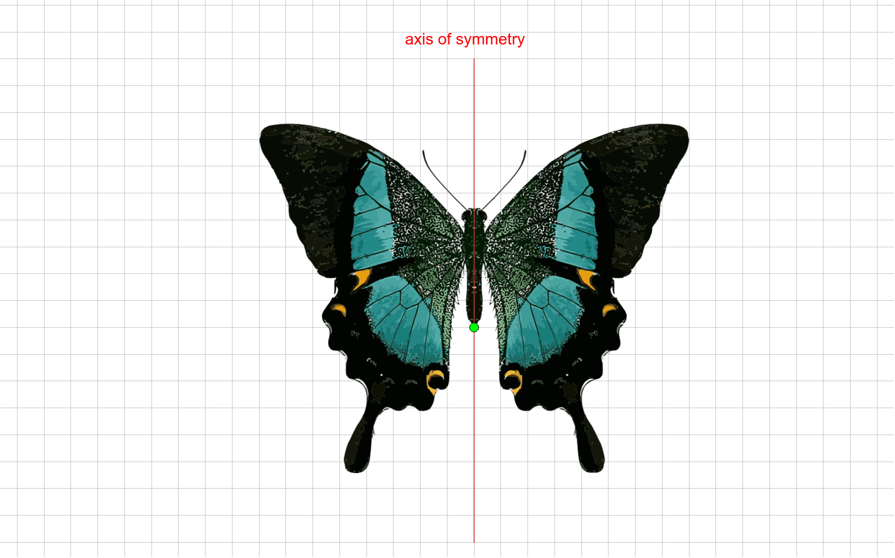
Fig 2.3 Symmetry of a Butterfly
I then thought of how this could be relevant to the human body and its
symmetry. I recalled reading articles and watching documentaries
regarding skin conditions/ diseases and came across vitiligo which
is a skin condition most prominent amongst darker skinned people. I
could imagine this image in my head if it were to be related to
Principle of Closure, as well as Principle of Symmetry as though
imperfect, the woman's facial vitiligo patterns are somehow
symmetrical, like a mirroring of half the face to the other. Fig 2.2 of
the models symmetrical facial features and pattern of the skin is
identical in the sense that if you were to fold a butterfly in half then
unravel it, it would be similar. Think of the butterflies pattern as the
pattern of a human skin with vitiligo, each one is unique and different
in shape, colour, pattern and size.
Process of Exercise 1 - Gestalt Theory

Fig 2.4 Photograph of my sister which I applied a black and white
filter on.

Fig 2.5 A doodle on the picture of what I think vitiligo would look
like.

Fig 2.6 Final Product on Gestalt Theory
Not only do animals have this unique pattern, but also us primates be
it a birthmark or a autoimmune disease which causes skin disorders as
such. I want to demonstrate my understanding of the Principles of
Gestalt Theory through my work and description this work. An elaboration of how I came up with this design is derived from
personal research and knowledge through articles, documentaries and the
general web on the skin condition, vitiligo. The app that I used for
this digital artwork is "Sketchbook", which is a great platform and
is accessible to all and very straightforward. The gadget I
used for this design is my Wacom Intuos pro, a refined tablet for
digital art. I first started off with a photography session of the
model, my sister, in order to use it as reference. I wanted to capture
the general facial features, shape and idea but not the
entirety and details of what a human face would look like. I used
the basic two colours, which is black and white. I had to be very
careful to control the impulses of adding in more details to
make it an obvious image of a face, as I want to be very
minimalistic in this piece. I selected a simple paintbrush, set in
the opacity of 90% and selected the mirroring effect at the very centre
of what I imagined to be the axis of the face. This mirroring
effect enables me to draw half of the face, with the other half
automatically imitating my brushstrokes from the other half which
ensures perfect symmetry(Law of Symmetry), evidently in the image
above. I then disabled the mirroring setting to create natural/ random
patches of lighter areas(vitiligo) to show that this skin condition does
not leave perfectly symmetrical marks but rather in various places of
the skin. I feel that I have also achieved the details of what a
human skin with vitiligo would look like, which is the freckling
and splatters of lighter hues on the skin. I also feel that it
effectively touches on the Principle of Closure whereby without
including an overwhelmingly precise replication of a persons face, it is
still very much detectible that it is in fact a face with some
form of skin disorder, that is vitiligo.
Process of Contrast
Overripe Banana Photography Session(Contrast)
Fig 3. Overripe banana
Fig 3.1 Overripe banana of different positioning
Fig 3.2 Chosen banana image for the painting.
Fig 3.3 is the finished painting for "Contrast"
The painting above is an oil painting of a banana in a technique called
"still-life". In this case, it is a commonplace food (natural rather than
man-made) which conveys little about the rich associations inherent to
this genre. The medium which I've used is easy for me to control and has a
shinier finish as opposed to a matte watercolour finish, despite its
lengthy time to dry. I am personally comfortable with the traditional form of art, which is
painting and sketching as thats what I am used to doing as opposed to my
new found interest of digital art. I chose to do this painting to show
"Contrast" as I've intentionally chose a monochromic background/ set up
and the banana as a pop of bright colour in contrast to the monotone,
dull grey background.
Fig 3.4 Cropped the image as Dr. Jinchi requested to make it look neater
Feedback 7/9/2021
Dr. Jinchi stated that my exploration and how I reached my final piece
for Gestalt was good and the work I did on principle of closure &
symmetry has a very interesting effect. She then went on to review
"Contrast", where she states that it was straight to the point(Banana) and
how contrast was noticeable from the background and the main subject. She
also said that there is contrast on the banana itself due to its black
spotting on the bright yellow body. She then asked what the base of the
painting was, which I explained to be canvas.
Reflection 7/9/2021
I feel that it is important to utilise and demonstrate my abilities in
pivoting between traditional styles of art and modern ways of conveying
art(digital), thus why I wanted to show my technique of both worlds in
Gestalt theory & Contrast. I also felt that it would be more
interesting that way.
After receiving feedback from Dr. Jinchi, I realised that I should be
more detailed regarding the materials/ supplies that I used, therefore in
the future I will me more certain on specifying those aspects. Getting
those feedbacks helped me understand what parts are needed to be tweaked
and improved in order to have a positive progression.
Comments
Post a Comment