Typography Task 1 Exercises
Week 1 of Introduction and Briefing - 25/8/2021
Jodiann Yeoh Chooi Kit 0352238
Module : Typography
Task : Exercise 1 & 2, Type Expression & Text Formatting
LECTURES
Week 1 : Introduction and Briefing
The first session started off with a small overview of the program
Typography by Mr. Vinod. Directions were given pointing
towards YouTube, Facebook, Times etc. as the locations for any content updates and announcements & of
important videos which contained the lectures, things to download like the
10 typefaces as well as links to exemplary work done by former students as
guidance of the structuring of the blog that we are supposed to
create for documentation and grading purposes. Mr. Vinod then explained
how typography is a continuous cycle of designing then refining through
feedback. I agree with his statement as without constructive feedback and
persistent correction, it leads to the betterment of the quality of my
designs.
Today we were advised to watch some of his provided lecture videos
on YouTube on the introduction of typography, development of
typography, the basics, and how to create an e-portfolio which is an
online blog(which frankly was pretty hard as I'm the absolute worst at
therefore struggled). I had decided to watch the first few lecture
videos a week prior before class to familiarise myself with what's being
taught, and ease out the uncertainty due to the fact that Typography is
something I have no experience with.
Heres my personal notes that I've gathered from the video
-Typography takes into account the way the design comes together as one
harmonious and sensible being, whether it does what its supposed to do
visually, which is a hidden message or something literal made into
something more eye catching or interesting. Eg. a sign for going down
the stairs has to convey a message effectively, you wouldn’t want too
much words.
-Everything learned in this module is applicable and connected to
others
-The sensitivity you see in the logo type(design of the wording) takes a
great skill.
-History of typography and its progression is important, as
you can't dive into something blindly without knowing what's it
about.
Typography : Development/ Timeline
-Culturally biased/ inapplicable to the asian scene as much info
presented is written from the perspective of the western world which tends
to ignorantly or conveniently overlook inventions and innovations in
Asia.
-the tool you hold in your hand plays an important role in crafting the
type of scripts, also the material like soft and hard clay.
Early letterform dev : Phoenician to Roman
-Etruscan(and then Roman) carvers working in marble painted letterforms
before inscribing them. Chiseling is one of those methods which requires
attention to detail and a precise hand in order to prevent errors which
can be costly and time consuming.Certain qualities of their strokes - a
change in weight from vertical to horizontal, a broadening of the stroke
from start to finish - carried over into the carved letterforms.
-Phoenician to greek to roman
Hand script from 3rd - 10th century C.E.
-Square capitals were the written version that can be found
in roman monuments. These letterforms have serifs added to the finish of
the main strokes. The variety of stroke width was achieved by the reed pen
held at an angle of approx 60 degrees off the perpendicular.
-A compressed version of square capitals, rustic capitals allowed for twice as many words on a sheet of parchment and took
far less time to write. Pen/ brush held at an angle of approx 30 degrees
off perpendicular. Although its more convenient, it was harder to read due
to their compressed nature.
-the development of lowercase letters was the result of writing uppercase
lettering fast
-Charlemagne, the 1st unifier of Europe. So due to the different
variations/ many styles of Phoenician’s, there were clashes and conflicts
in beliefs. So he entrusted the Alcuin of York to standardised the use of
uppercase and lowercase letters which led to the development of
punctuation.
-Its like an idiolect where instead of differing speech habits according
to different people, its the different style of writing amongst people,
much like a fingerprint as you may.
-Blackletter to Gutenberg’s type which included engineer, metal smithing,
and chemistry. He combined the 3 and accurately mimicked the work of the
scribes hand - Blackletter of modern Europe.
Text type classification(Dates of origin approximated to the nearest
quarter century.
-Typefaces have developed in response to prevailing technology,
Commercial needs, and aesthetic trends.
-1450 Blackletter - the earliest printing time, its forms were based upon
the hand copying styles that were then used for books in northern Europe
eg cloister black, 1475 old style which were used by Italian humanist then
spread to England which were used by scholars for book copying eg
bembo, Caslon, Dante etc. 1500 italic which is an echoing contemporary
Italian handwriting. The first italics were condensed, allowing more words
per page. 1500 script which originally and attempt to replicate engraved
calligraphic forms, thus class is not entirely appropriate and lengthy
text settings. Ensure the applications, however, it has always enjoyed
wide acceptance. Range from formal to traditional to the casual and
contemporary. 1750 transitional which is refinement of old style, achieved
because of advances in casting and printings. 1775 modern which is a
further rationalisation of old style of letterforms. 1852 square serif/
slab sherif.
Week 2
Typography : Basic/ Describing letterforms
-Ascender height, cap height, median, x-height, baseline and descender
height
-Stroke - any line that defines the basic letterform
-Apex/vertex - a point joining two diagonal stems(apex above and vertex
below
-Arm - Short strokes off the stem of the letterform eg. E, F
-Ascender - Portion of the stem of the lowercase letterform that
projects the median eg, d, b, h, k
-Barb - half-serif finish on some curved stroke like the big letter C,
G and S
-Beak - half serif finish on some horizontal arms like big letters E,
T, L
-Bowl - rounded form that describes a counter, can be either open or
closed eg. b, d, p q
-Bracket - the transition between the serif and the stem, the bottom of
the T and 1(base)
-Cross bar -what joins two stems together eg A and H
-Cross Stroke - the horizontal stroke that joins two stems together eg
f and t
-Crotch - Interior space where two strokes meet/ the middle of two
strokes eg V and K
Week 3
Text/ Tracking : Kerning & Letterspacing
Kerning - automatic adjustments of space between letters
Letterspacing - to add space between letters
Tracking - Addition & removal of space in a word or
sentence
*use InDesign when there is a large body of text*, in indesign, facing
pages is usually use for books and turning it off would mean for leaflets or
things that require just one side used.
Normal, Loose, Tight tracking
Formatting Text
Flush Left - asymmetrical, starts at same point but ends at wherever it
ends, space is consistent making it an even grey value.
Centered - symmetry upon text(middle so equal value and weight on both
ends), strong shapes, amend line breaks so it does not appear too
jagged.
Flush Right - opposite of flush left, useful in captions where relationship
between text and image might be ambiguous without strong orientation to the
right.
Justified - like centering(symmetry), expands or reduces spaces to ensure
both ends are touched and filled in.
Leading & Line Length
Type size - should be large enough to read easily
Leading - text type set too tightly(vertical eye movement) cause reader to
lose his/ her place. Set too loosely creates striped patterns distracting
reader from material at hand
Line Length - Shorter lines(less reading), longer lines(less). A good rule
of thumb is to keep length between 55-65 characters. Too long or short
impairs reading.
Type Specimen Book
-shows samples of typefaces a different sizes, no one can make
reasonable choice of type. It is determined on screen when its final
version is to read on screen.
-an e-book is to provide an accurate reference of type, type size,
type leading, type line length etc.
Week 4
Typography : Text/ Indicating Paragraphs
Pilcrow - An archaic way of indicating paragraphs from medieval manuscripts
Line space(leading*) ensures cross alignment across columns of text. Most commonly used today. Lines must cross-align
Line Spacing vs Leading
Standard Indentation
Extended Paragraphs
Window - short line of type left alone at the end of the column of text
Orphans - short line of type left at start of column
Window & Orphan -
Headline between Texts
Cross Alignment
INSTRUCTIONS
Task 1 Exercise 1 : Type Expression 25/8/2021
List of type expression word options that were set up as polls to vote on
the top 7 words.
-"Terror" is mandatory
-Error
-Melt
-Gone
-Light
-Pour
-Shiver
Source of inspiration for Type Expression
My source of inspiration was Google and Pinterest where its filled
with readily available ideas of type expression.
Fig 1. Design by GraphicMama taken from Google
Fig 1 shows a type expression which inspired me to think critically about
how the design should relate to the meaning of the word. The designer had
stacked the word layer on one another, creating a glitchy feel. This also
enables interaction with the viewers eyes due to the snake-like movement
of the layering.
Fig 1.1 Type Expression from Google by Karthik Patanjali
The type expression above of the word "peep" is another source of
inspiration for me as I understood its message at a short glance, which is
generally what's supposed to be achieved. Imagery is involved as the
two e's looks like two sneaky eyes discreetly peeking out
with a pair of ears on each side which are the p's. This gives me a
realisation that the type expression leaves room for the viewer to
interpret, and it matters on how it is produced to create that
visualisation.
EXERCISE 1(Type Expression)
Instruction - "Terror" is the mandatory word to compose
and choose 3 more from the given word choice which are error, melt,
gone, light, pour, shiver. No colour is allowed, and choice of fonts
must be selected from the provided 10 typefaces. I have decided to
choose melt, light and pour alongside with terror.
What is Type Expression?
In my understanding, it is an art form where text is highly visual
and becomes more of an image than a text. It means the physical
manipulation of type to create a typeface with meaning and richer
expression.
Drafting of My Designs
I will be creating with 3 drafts for 3 words and 4 for one of
them therefore a total of 13 drafts/ ideas.
Terror
Fig 2. Hand Drawn Draft of Type Expression "Terror" 25/8/21
"Terror" Draft Description
The top left draft has a rough looking body as I wanted to replicate
what the sound of piercing screeching/ screams would look like. I have
substituted the letter o with a simple skull drawing, which resembles
the shape of the letter o. I think that really added to the meaning of
the word.
The top right draft has a larger/ chunkier body of wording, very similar
to the titles of old cartoon horror movies. I designed the letter O in a
way to resemble a noose which symbolises death, therefore giving off an
eerie aura. The creepy vibe is maintained alongside with the background,
which is a mysterious man supporting himself on an opaque glass which
gives the impression that someone is watching with bad intentions.
The bottom left draft shows an elongated and draggy type of body. The
texture of each stroke implies that it is the scratches of a large
animal or someone holding on for dear life. This style is very common in
book titles as well as horror movies.
Each draft were first sketched out then outlined with a 0.7 black pen
for a neater look.
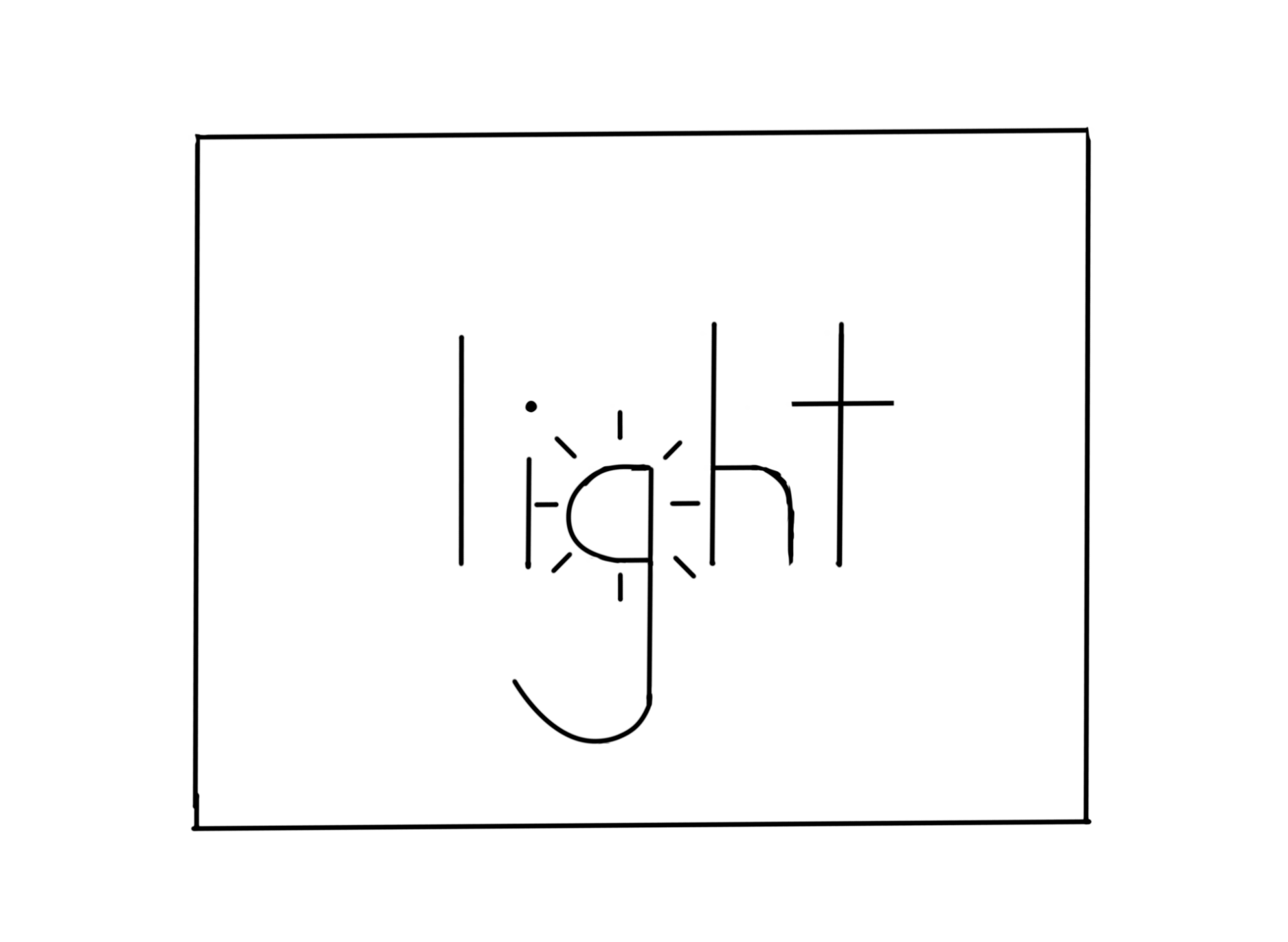
Fig 2.1 Hand Drawn Draft of Type Expression "Light" 25/8/21
"Light" Draft Description -
For this word, I decided to go for some simplistic designs. The top
left's letter g was made to resemble the sun. The top rights letter I
was made to look like a lightbulb. And the bottom left's draft has a
different meaning as opposed to the other two, which is lightweight like
the wind. I wanted the form to look like the movement of the wind which
is smooth and continuous, thus why I decided to go for a cursive font
that's smooth and usually light to the eyes.
Fig 2.2 Hand Drawn Draft of Type Expression "Melt" 25/8/21
"Melt" Draft Description -
For the top left draft, I wanted to go for something which is similar to
a thick liquid slowly dripping down to the point where the shape of the
words would bend and lose its form. I was quite happy with the
results.
The first think that I think of when I hear the word "melt" is ice cream.
The sweet yet messy dessert that we all so enjoy eating in the hot sunny
weather, so I took inspiration from that for the top right draft. It shows
an ice cream cone which had tragically been dropped on the ground.
Its splatter and liquid flowing to the sides were utilised to make it
resemble the shapes that make up the words of "melt".
The bottom left draft shows the word with a slime like surface with
much parts drooping down. The L is made to look stretched as it can be
imagined that someone was playing with the slime and stretched it to such
a long length.
For the bottom right draft, I wanted a sleeker and more classical
look rather than the contemporary designs of the rest. I decided to add
simple indents of drips onto parts of the word.
Pour
Fig 2.3 Hand Drawn Draft of Type Expression "Pour" 25/8/21
"Pour" Draft Description -
The top right draft shows the design of the word "pour'. I went for the
wavy design extended below the word as it resembles the meandering of
natural river forms. It can also me interpreted to be spilled water.
Furthermore, the top right draft shows a literal take of the word pour,
like "the sky is pouring" as they all say. The individual letters of
"pour" was intentionally made to look like the constant downpour of
the droplets of the rain.
Lastly, the bottom left draft shows the word "pour" being poured out of
a vessel/cup. The word was designed to look like the shape of actual
water pouring.
Week 2(Digitisation of 1 draft each of my favourite work from each
type expression)
Fig 3. Digitisation of "Pour" 4/9/2021
I chose the most simplistic design out of the four to digitise as I
feel its effective both visually and meaningfully. "Pour" is another
term to describe the strength of the downpour, which is usually
associated to heavy, consistent rain. Thus, why I used the word pour
itself to convey the continuous droplets coming from the cloud.
Fig 3.1 Digitisation of "Light" 4/9/2021
I chose this design out of the four as I feel that it creates a sense of
"lightness" to viewers. The skinny words as opposed to a thicker font
contributes to its overall "weight" on the eyes.
Fig 3.2 Digitisation of "Terror" 4/9/2021
I chose the boldest one out of the four drafts which consists of a
chunkier font. It creates the effect of someone shouting and
creates a sense of shock. I've also made the "O" look like a noose to
further create an eerie aura.
Fig 3.3 Digitisation of "Melt" 4/9/2021
I chose the most minimalistic, and visually appealing design out of the
four. The in-dents on the font suggests its corroding through the
letters, enabling users to know straight away that it is in fact
melting. I ensured that the digitisation would make it more cleaner than
the initial sketch.
Fig 3.4 Type Expression Board 16/ 9/ 2021
Fig 3.5 Amended Type Expression Digital Board 22/9/2021
Fig 3.6 Digitalised Type Expression PDF 22/9/ 2021
Week 3(Animating Type Expression Into Gifs)
Fig 4. Animation/ Gif of "Melt" 9/9/2021
I did each frame on Autodesk instead of Illustrator due to my
circumstances which was a challenge. Altogether I made 7 frames. 0.1
second each frame.
After Mr. Vinod's review of my 1st animated attempt(in detail in the
feedback section), I went on to add in 9 more frames, totalling 16 frames for this animated typeface. The image below
shows what the process looks like.
Fig 4.1 Animating the frames on Adobe Illustrator then Photoshop 12/9/2021
Fig. 4.2 Revision of Fig 4. from Mr. Vinod's feedback(specified in week 3
feedback section) 12/9/2021
I took Mr Vinod's feedback and made sure that the drip continues all the
way down and that the last frame is 3 seconds. I feel that I've developed
and improved on the type expression drastically which could not be done
without his critique.
Fig 4.3 Final PDF Task 1: Exercise 1 Animated Type Expression 12/9/2021
Task 1 Exercise 2 : Text Formatting 15/9/2021
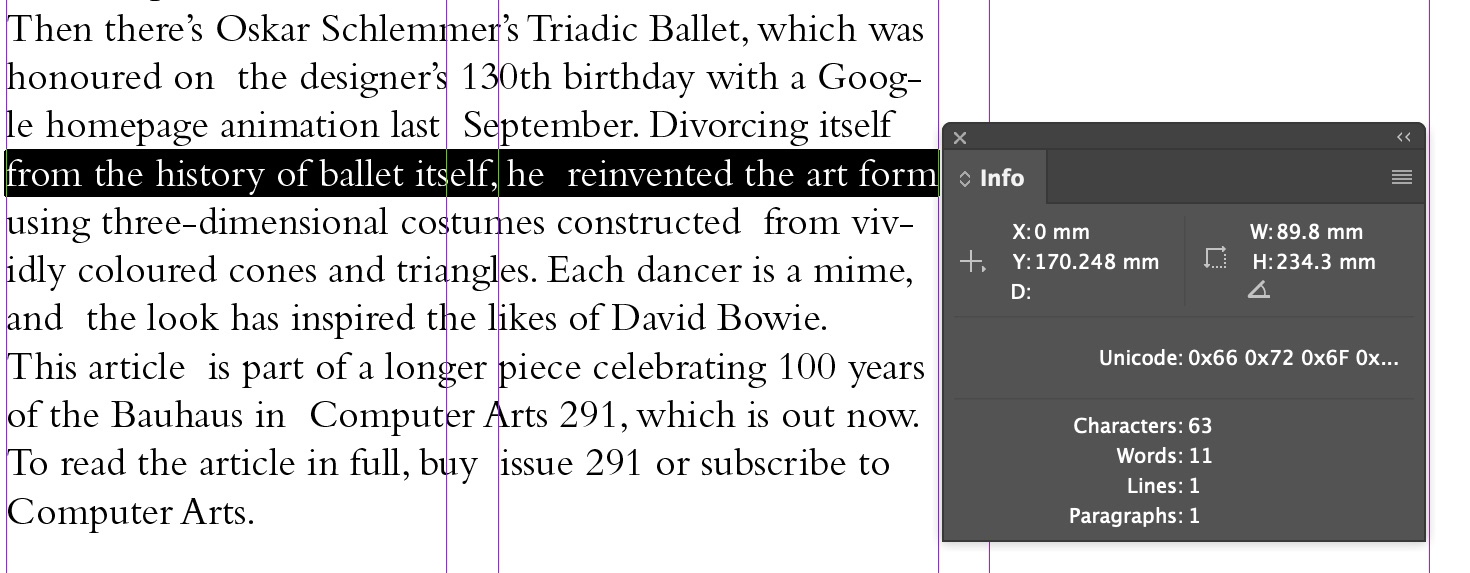
The focus then shifts to the next exercise, which is Text Formatting where areas like leading, ragging & letterspacing, baseline grid, cross alignment etc. will be touched on in the provided recorded lectures Typo_Ex Text Formatting 1:4 - 4:4A. Adobe InDesign is the software that will be used to proceed with this task as opposed to illustrator. This is because InDesign's features are catered for lengthy texts suitable for creation of articles and so on.
Fig 6. Without Kerning & LetterSpacing 15/9/2021
Fig 6.1 With Kerning & LetterSpacing 15/9/2021
Fig 6.2 With & Without Kerning & LetterSpacing back to back. 15/9/2021
Progression of my attempt on Text Formatting
Attempt No. 1
Font used - Bembo Std Regular
Font size - 11 pts
Leading - 13.5 pts
Number of characters per text column - within the 55-65 character amount as shown below.
Spacing between paragraphs is also set to 13.5 pts and automatically converted to 4.762mm.
Fig 6.3 Ensuring it stays within 55-65 characters per text column 16/9/2021
Fig 6.4 Before Ragging & Letterspacing 16/9/2021
Fig 6.5 After Ragging & Letterspacing 16/9/2021
Fig 6.6 Left Justified so both sides touches the end 16/9/2021
I took into account on whether it would cause it looking too spaced out or too tight but in my case, it wasn't drastic, keeping the hyphenation is another factor on why it isn't too spaced out(as Mr. Vinod mentioned in the lecture)
Fig 6.7 Baseline Grid error 16/9/2021
Attempt No. 2
Font used - Univers LT Std 55 Roman
Font size - 9 pts
Leading - 11 pts
Number of characters per text column - within the 55-65 character amount as shown below.
Spacing between paragraphs is also set to 11 pts and automatically converted to 3.881mm.
I followed the exact same instructions and process for this attempt too but this time I used left align for text.
Fig 7. Before Baseline Grid and Alignment 16/9/2021
Fig 7.1 Text After Baseline Grid and Alignment 16/9/2021
Fig 7.2 Heading After Baseline Grid and Alignment 16/9/2021
This time, it evenly touched the baseline grid and was perfectly aligned. Same applies with the heading.
Fig 7.3 Hidden Characters within Text 16/9/2021
Fig 7.4 Final Task 1: Exercise 2 Text Formatting 16/9/2021
I realised that I made a mistake on the image description so I corrected it.
Fig 7.5 Corrected version of Fig 7.4 22/9/2021
Fig 7.6 Final PDF Task 1: Exercise 2 Text Formatting 22/9/2021
FEEDBACK
Week 2(Feedback after completion of week 1's assignment)
Mr Vinod stated that if we are dependent on the direction given, we
become dependent therefore we cannot develop our knowledge and skill. Thus
why his feedback had to be "minimal". He used metaphor of a developing
chicken egg(us). So if we interfere with the natural process, something
wrong would happened. So it is best to let it do its thing so it will
gradually become stronger and grow to be able to crack its own egg
itself.
Mr Vinod went on to review each students work on their blog. When it came
to my turn of reviewing my type expression progression/ drafts,
Mr Charles and Mr Vinod stated that the expression of the meaning of
the word was effectively conveyed, and said its "great" and there was
nothing much to comment or critique on which I was quite happy about.
However, they did say that distorting the type is fine but
not advisable, and that minimal manipulation is best. They rated by
work a 3.5 or 4 out of 5. I found their feedback to be quite useful
as for the next task, digitalisation of my design, I would ensure to
take their advise into account to ensure that I am reflecting my
understanding.
Feedback given from group I was placed in
-Are the explorations sufficient?
Yes
-Does the expression match the meaning of the word?
Yes
-On a scale of 1-5, how strong is the idea?
4.5/5
-How can the work be improved?
That I shouldn't over do the distortion of the
typeface
Week 3(Feedback of Final Digitisation and Attempt of Animating)
He said that everything was great and that I should stick with
"melt" to be animated. I agree with that as my favourite design was from
melt. He then said that all that was needed to be done was to digitise
and animate the typeface on illustrator itself. The reason why he
mentioned that was due to my Adobe Illustrator account not being given
to me for the first 3 weeks, which is why I had to find other
alternatives like Autodesk Sketchbook to both animate and digitise
my designs from.
After attempting the animating task of "melt"/ our chose typeface
design, we had to submit it in the typography Facebook comment
section. As I did it manually, it was certainly more time consuming
as I had to manually create each frame on Autodesk as opposed to
the convenience if I were to create it
on illustrator itself. However, I have to use what was available at
the time. Mr. Vinod then replied with feedback/ a review of my
gif/animation and said
"when you do the final piece over the week, let the melt continue to
the bottom, then pause on the final frame for 3-5 seconds.". I
thought it was a good idea as the one I made, the drip had
stopped mid way which looked sort of awkward so making it continue
down to the base would definitely give more of that melty effect. Also, the 3-5 seconds on
the final frame would give a longer time to actually take in what it
would look like at the end.
Week 4(Feedback of blog and Final Animation of Type Expression)
Mr. Vinod advised the whole class to ensure that only pdf's are inserted in our blog for final designs and that we should refer to past students work to get a grasp of what to do and how to format it & additional info as reference. He stated that my digital work for Task 1 Exercise 1 must be featured in my blog and one using illustrator. He also said that "the animation is good". He also emphasised that my digital animation was very good and asked about how my progression in which I replied was well.
Week 5
We should refer to old students work and to follow the format. He said that my blog was messy and guided me on how to label my posts to make it more neater. I should do all my work on AI and that I should amend my error in the image description of text formatting which I both amended right after. He stated Exercise 1 was what he liked in particular.
REFLECTION
Week 1
Experience - Watching the lecture videos has assisted me in understanding
the history behind typography which is essential to moving
forward.
Observation - Instructions were easy to understand and setting up my own
blog with the assistance of Mr Vinod was very helpful.
Findings - I found myself struggling in the provided words to create
expressive typefaces like terror and patience was also a problem as I
am somewhat a perfectionist therefore would take a long time creating a
design. However I do believe it was a good struggle.
Week 2
Experience - I am now more self aware of what's needed to be done to
improve, feedback was useful for future assignments to ensure that the
same mistakes won't happen
Observation - I can see myself being more confident in what to do with
the work that's given
Findings - I should pay careful attention to not over-distort my
typeface, minimalism is better
Week 3
Experience - It was definitely challenging to create each frame from
scratch but was happy that I had someone to help out with the compiling. I
think it turned out good. After finally receiving my creative cloud
account I took Mr Vinod's feedback,
"when you do the final piece over the week, let the melt continue to the
bottom, then pause on the final frame for 3-5 seconds.", and proceeded to
continue developing my type expression animation.
Observation - I took some time finding and
researching how to compile the frames together but thats a part of the
learning process which I feel has been effective.
Findings - Planning ahead and knowing what you want to do is key in
creating an aesthetically pleasing design with an effective message.
Week 4
Experience - Text formatting was a struggle at the start as each step is important and a slip up or a small factor would essentially mess everything up. The lecture videos were lengthy and rewatching is inevitable as I found myself having to reply the lecture again. However, I learned to take notes on a notebook on the side to minimise that.
Observation - As I tried again and again, I finally managed to do text format correctly and I'm happy that I'm improving & able to decipher what was wrong at the end.
Findings - To make multiple attempts until you get it right. We will not be successful at every first attempt thus why it is a good learning curve.
Week 5
Experience - Brutal in the sense that much time was spent doing it but fulfilling when I see the end results.
Observation - I should pay attention to how I manage my blog which may come off as messy.
Findings - It was a challenging process but good form of learning.
FURTHER READING
Week 1
Thinking with type by Ellen Lupton 2004
This book is a gentle but practical introduction on why typography
matters and why one should care about it. It contains many images of type designed in various ways, integrated with descriptive text to demonstrate various principles of typography.
In additional to explaining how to do things right, Lupton provides many helpful examples of what not to do.
This book is organized into three sections: letter, text, and grid. Each section begins with an overview of that category, including its definition and history, then splits into multiple smaller sections about specific subcategories.
Below are a couple things I found most interesting from each section:
Letter:
Different fonts are designed to be printed in different sizes. For example a font with a large x-height and relatively thick stroke weight of relatively uniform thickness works well at a small size.
Different typefaces should be mixed only if there's a noticeable difference between them.
Text:
"Although many books define typography as enhancing the readability of the written word, one of design's most humane functions is, in actuality, to help readers avoid reading".
Lupton considers various forms of presenting information and how linear or non-linear they are. Text has the capacity to be much less linear than speech, especially when it's stored in a database.
Grid:
The concept of splitting text into smaller blocks on the page is relatively modern, beginning around 1940.
(Lupton makes the outdated claim that most modern webpages use HTML elements to lay out the positions of their main elements. This isn't true. Nowadays, most pages use CSS to position elements instead.)


Comments
Post a Comment