Design Principles
(Week 1-3)
Jodiann Yeoh Chooi Kit 0352238
Module : Design Principles
Task : Exercise 2
LECTURE
This assignment which was initially supposed to be assigned to us during
week 2 is now brought forward to week 1(24th August) as on the 31st there
would be a public holiday(Merdeka). Ms. Yip has advised us to read through
the elements and principles of design from the links provided in times. As
well as to watch the pre-recorded lectures 2 and 3 in Teams and to proceed
with Exercise 2 which is to choose 2 Principles from Emphasis / Balance / Repetition / Movement. Produce 1 design for each
chosen principle.
Personal notes taken from the pre-recorded lecture 3(Repetition &
Movement) by Dr. JinChi
The lecture started off with Dr. JinChi showing us a series of images to
find out how they're in common eg. grills of a window, plant decor,
pedestrian walks, skylines, individual units of a condo, religious places
and books placed on shelves. These visual examples indicates that repetition
exists all around us.
Repetition
-makes a work of design seem active.
-creates rhythm and pattern within the work.
-variety is essential to keep it exciting & active, avoids
monotony.
-pattern increases visual excitement by enriching surface
interest.
-variety is the slight changes in composition which
involves different elements and objects. It includes, varying
angles, exposure, composition etc.
-common in art and craft like traditional clothing, objects like
beaded shawls, batik, sandals etc. which all relate to the rich patterns of
traditional Malaysian designs as well as different cultures such as
aboriginal designs.
Fig 1. Traditional Lanterns depicting repetition
How repetition creates pattern
-Its intriguing therefore easily attractive to ones eye. It can be
both physiologically and psychologically satisfying/ engaging due to the
presence of rhythm.
-With variety added into repetition, it creates a smooth, continuous
movement/flow through the radiation of sizes, creating a sense
of engagement between viewer and design.
-Closed composition is the visibility of all the subject matter in an
enclosed space. Whereas, open compositions is when shapes run off the edges/
boundary of the picture which allows for more active eye movement and
imagination.
Fig 1.1 Personal notes taken of closed and open composition from the
lecture
-Repetition & Movement are also found in different settings like
traditional Chinese flower paintings, fashion
catalogues, childhood animated movies like fantasia.
-Solid non-moving images can show movement.
-Repetition is commonly used as a way of setting the theme. For example,
the interior of a home which can be predominantly made with visible wood
therefore would likely be matched with furniture of earthy tones like
brick red, brown, cream and perhaps few contrasting elements. All of
which gives a "cozy" and homely feel.
Fig 1.2 Notes on provided YouTube link under Principle's of Design
The hand-written notes which I wrote down whilst listening to the Youtube
above is for personal reference incase I need clarification/ in times of
uncertainty. I personally found no issue understanding each principle as
each element has to be considered in order to create a well made design,
something I strive for. The circled principles (No.4 Movement and
No.6 Rhythm/Repetition are the two principles I've decided to go
forward with on for Exercise 2)
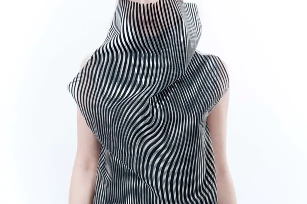
Movement
Movement is the motion of an image which leads the eye in a path. Movement
comes from shapes, forms, lines and curves. An example of such would be
the optical illusions that we all so commonly see like optical
illusions created by fashion, famous art pieces like starry night, or
psychological optical illusions with a hidden image within it.
Fig 1.3 Movement created by the illusion of the clothing
Dr. JinChi then moved on to explain two side elements of design.
Firstly, Hierarchy, used as a choreography of content in a composition to communicate
information & convey meaning. It is used to direct a viewers gaze to
the most important information first, then navigates you to the secondary
content. Size plays a huge role in identifying hierarchy as larger
images/wording would most likely be more visually captivating to the
eyes compared to smaller ones. Same applies with vibrant/ a pop of colour
as opposed to dull colours.
Fig 1.4 Example of Hierarchy in design of a poster
Secondly, Alignment, also known as symmetry. It's creating a common centre on a design which
creates a sense of unity and cohesion which contributes to the
overall aesthetic and perceived stability. It shows movement
while systematically laying out information in an orderly fashion. As
Dr. JinChi described as " order in chaos".
Fig 1.5 Example of Alignment in design of a graphic work
INSTRUCTIONS
Exercise 2 (2 designs in total): Choose TWO principles from
Emphasis / Balance / Repetition /
Movement. Produce 1 design for each chosen principle.
EXERCISE 2
PROCESS OF "REPETITION"
My inspiration of the Principle of Repetition would be from the
70s which was the birth of groovy, psychedelic designs which I can
say is one of my favourite eras of art. I am particularly fond of the flower patterns of the time, or "flower
power" as they would call it.

Fig 1.1 Bikini Bottom Background
The image above shows a reference of the bikini bottom from my famous
childhood cartoon, Spongebob Squarepants. The colour and the random
bubble-like form of the flower is appealing to the eye therefore I take
inspiration from its shape as shown below.
Fig 1.2 Inspiration taken from Instagram
When I was strolling through my daily dose of instagram, I ran
across this video of a photographer creating a painted backdrop of a similar
design of Fig 1.1. I liked how it was closely placed onto one another,
creating a repetitive, continuous flow of squiggly lines which resembled the
petals of a flower.
Fig 1.3 Inspiration from google of 60s flower pattern.
The similar hues of colours is very attractive to the eyes and the shapes
and size, as well as placement(rows) of the flowers is satisfying to ones
gaze. Thus why it inspired me as it touched the element "alignment" which
was explained above.
Fig 1.4 Drafting
The draft on the top right is inspired by Figure 1.1. I chose to make it
a solid design, like a paint splatter rather than including the details of
the petals and middle part of the flower as from afar, it would look
neater and have a bolder look. I also made the shapes random inproportion to make it more interesting to the viewer. However, it also relates
to the principle of repetition due to same subject being used in different
positioning. It was also inspired by Fig 1.2 due to its more compact
composition where unlike Fig 1.1, empty spaces are taken into account by
filling it in with the same pattern, creating a smooth transition for the
eye. Furthermore, the draft on the top right is also inspired by Fig 1.3
which is flower patterns from the 60s as well as my childhood. I remember
having these flower stickers all placed in that pattern, and I'd just peel
them off to stick onto any surface I could get my hands on.
Instead of the congested look of Fig 1.3, I went for a more separated
design to touched on the aspect of spacial awareness and giving the viewer
a chance to "breathe". It touches on the Principle of Repetition as
the shape, placement and colour of the flowers are consistently the same
throughout the design.
The very bottom is a draft of the final idea. I evidently chose to combine
the top right and left idea by taking the shape and detailing of the pink
flower as well as the trippy effect of the left purple flower which had a
more randomised proportion, resembling the liquid moving inside a lava lamp.
Also, I chose to render the drafts in colourful, bright
colours(highlighters) as it reflects the fun, care-free spirit of the
70s.
Fig 1.5 Video of "Repetition" design process
The video of the design process is done on Autodesk Sketchbook and
drawn using the external tablet, Wacom Intuos Pro & recorded using
QuickTime Player(Mac). I started off with a general sketch of the form of
the lava lamp like liquid shape on the flower using the "predictive stroke"
tool. After I'm happy with the sketch of what I wanted the design
to be, I then enabled the "selection tool" in order to select areas
which I want to fill in with colour. I then used the "fill" tool which
fills in my desired colour onto the selected areas(first the petals of the
flower then the middle of the flower, then lastly the background). Alongside
from creating my design, I feel that I have become more familiar
with the tools available on the app as it in a way forces me to experiment
with different tools which I was unfamiliar with, which I think is
crucial for a designer because many times, we would have to
be spontaneous in learning the most convenient and effective ways of
creating something.
Fig 1.6 Completed Piece of "Repetition" from video above
I really aimed for repetition through different variations of proportions
whilst maintaining similarities(main focus). I'm pleased with the end
results, especially due to its dramatic pattern, creating an excitement to
viewers. This design also relates to "open composition" mentioned in Ms.
Jinchi's lecture which contains an unfinished pattern suggesting
continuation on the outside of the designs frame.
Fig 1.7. Revision of Fig 1.6 "Repetition" 12/9/2021
After Dr. Jinchi's(which is specified in the feedback section), I decided
to take her advise by changing the original black background which is
too harsh compared to the flowers, and made it into a complementary colour
of the sky blue flowers. I chose a coral orange colour which I felt
resembled the flower power age way more than the initial account.
After her feedback on experimenting more/ further or repetition, I are up with another 3 more designs and the one that Dr. Jinchi took liking the most amongst all of them was the image below.
Fig 1.8 Further Revision of Fig 1.7 which became the chosen Final for Repetition 13/9/2021
I experimented more with the background which consisted of some colours of the rainbow which gave the psychedelic vibe of the 60s thus why Dr. Jinchi and I thought it stood out. The colour of the flower was also more vibrant/ bold(violet as opposed to the original blue) thus making the background blend well with the flowers.
PROCESS OF MOVEMENT
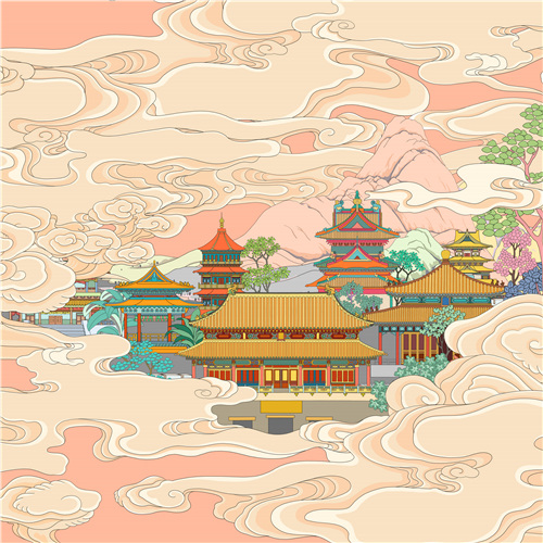
Fig 2. "A Fathers Gift" from chinadaily.com
I took inspiration from traditional Chinese artworks such as the image
above as I was inspired by how effective the movement of the clouds and mist
is so realistic and detectable from the painting. It creates a sense of
peace as you imagine yourself in a paradisiacal sacred place, much like
an afterlife dream.
Fig 2.1 Idea of Movement inspired by the mist.
For exploration, I chose to use a black paper as the background. I then
used a 2H pencil to roughly sketch out the design and areas of which it
will be placed. I used multi-coloured pastels to line the sketch then
using the tip of my finger to smudge the pastel to create a smoother
texture and smokier look in order to blend it with the background(rather
than harsh lines) to create a misty effect.
Fig 2.2 Final Piece of "Movement"
As for the final piece, I chose to go for a more classical/traditional look
of what you may see in common religious Chinese paintings of buddhist gods.
I used Autodesk Sketchbook app and my Wacom Intuos pro for this piece.
I found myself admiring and running my fingers through the waves of
the misty clouds of the framed painting that was hung up by my parents in
the household. It was a therapeutic thing to do, it was also spiritually
connecting especially to a non-religious person such as myself. I am happy
with how this turned out as I feel that I've effectively captured the
"movement" of what a natural mist and gentle water stream would look like to
ones eyes.
Fig 2.3. Revision and solid final from Fig 2.2 on "Movement"
I again took the advise that was given by Ms. Jinchi from Fig 2.2 also
specified in the feedback section and made the supposed final piece look
more dynamic in the sense that the mist looks like its trailing off the
frame.
FEEDBACK 7/9/2021
For "Repetition", Dr. Jinchi advised me that it would be better to use a
less harsh background colour as opposed to black. (complementary colours is
an idea) She suggested me to get some inspiration from the 60s-70s colour
scheme which would contribute to the vibrancy that was radiated by the
"flower power" era thats filled with colour and pop.
As for "Movement", she advised me to do some changes with this final piece
as well. She said that it was too flat to show movement and that the mist
should stretch out more to suggest movement more visually. She also said
that I should adjust the mist's proportion from large, thick mists in the
front, stretching out to smaller, disappearing mist thats trailing off the
scene.
She then concluded that everything else is good, so I'm quite
happy with that an will continue improving my work to show
progression.
Feedback after revision
Fig 3. Dr. Jinchi's Feedback after sending her my revision of repetition
and movement on telegram 12/9/2021
Dr. Jinchi then told me that I've improved but should experiment more so
back to the artboard I went
Fig 3.1 Feedback from Dr. Jinchi after further revision of Fig 3. which became my solid final piece for "repetition" 13/9/2021
I'm pleased with Dr. Jinchi's response and appreciate her taking the time
to give me a detailed review on whether I have improved. It makes me feel
guided throughout the process which contributes to my learning
process.
REFLECTION 7/9/2021
- Constructive criticism is very important to creating a composition which
demonstrates what's trying to be conveyed, and theres always space for
improvement.
- Movement and repetition correspond with one another.
- Dr. Jinchi's feedback enabled me to open up my imagination to think
critically on how the composition can be improved with more
exploration
- I should play around more with proportions to create a more visually
exciting work which would contribute to the overall aim/ purpose of the
topic.
Reflection after revising initial final work 13/9/2021
- I see a clear improvement in my final design due to Dr Jinchi's push to
improve through her vision of what the design would look like if I
put more thought into it.
- I have a better understanding of how to incorporate different elements
after these exercise and can't wait to see
myself further develop with the guidance of Dr. Jinchi.


Comments
Post a Comment