Typography Task 3A Exercise
Jodiann Yeoh Chooi Kit 0352238
Module : Typography
Task 3A : Typographic Expression & Communication (Text formatting &
Expression)

LECTURE
Instructed to watch recorded lecture videos
- https://youtu.be/zhVCyvjK25w
- https://youtu.be/EAWpYm1FyjE
- https://youtu.be/n9thDparUOU
Instructions before proceeding
- Sketch 5 possibilities then decide on 1 or 2 designs to
digitise.
- Look for typeface(from 10 provided) or from the internet as reference of
the font which resembles your sketch most.
- Deconstruct 3 letterforms from referenced typeface/ font.
- Create sketch manually or digitally(using illustrator), create final
digitisation of font on illustration then export to fontlab7 for proper
digitisation of font.
Purpose of deconstructing
- to obtain a better understanding of how typefaces are formed, the shapes
and tools necessary to create a visually accurate and appealing
typeface. This is also creates a sense of appreciation for the
amount of detailing and time needed to create a font.
Specific settings and dimensions
- 1000 pts X 1000 pts(typeface design), create 3 square artboards then one
long rectangular board for for the construction of letterforms.
- 500 pts X 500 pts for x height.
Notes
- if exceeds 500 pts, it must be reworked.
- exceeding the x height/ 500 pts is called an overshoot. This is due to
the fact that curves tend to look smaller therefore exceeds the
borders.
- use the shape tool or pen tool, depends on the complexity/ design of the
font.
- use the pathfinder tool to unite the parts which form the letter to
become one unified form.
INSTRUCTIONS
We are to design letters a i m e p y t g d o b ! , .
Research on type design

Fig 1. Anatomy of Typeface from Google

Fig 1.1 Anatomy of Typeface from Google aswell
Useful as its important to be aware of these structural guides and knowing the anatomy of body text prior to proceeding with sketches and design.

My overall stylistic approach for my designs were inspired by basic shapes, circles and ovals. I wanted to emphasise on the distinct curvatures of the letterforms.
I decided to go for the fifth design as I liked how classy it looked and has a certain flare to it.
I felt that none of the 10 typefaces provided resembled my 5th sketch except for a slight resemblance of the from "Adobe Caslon Pro Bold", so I went for a font called "Recoleta" which I then proceeded to deconstruct the 3 chosen letters.

Fig 3. Decostructed "o" - "Recoleta" reference (9/10/2021)
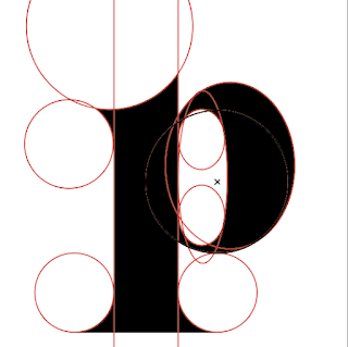
Fig 3.1 Deconstructed "p" - "Recoleta" reference (9/10/2021)
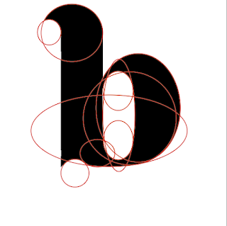
Fig 3.2 Deconstructed "b" - "Recoleta" reference (9/10/2021)
Attempt 1 (Exploration)

Fig 4. Using the shape tool to get a general idea of letter "a" (9/10/2021)

Fig 4.1 Construction of letter "a" progress (9/10/2021)

Fig 4.2 Construction of letter "a" progress 2 (9/10/2021)

Fig 4.3 3 letter which I designed/ digitised based on my 5th sketch. (9/10/2021)

Fig 4.4 Version with no deconstruction lines (9/10/2021)
After feedback of the work above(specified in feedback section Week 8), I decided that this will be my form of exploration rather than the final product/ design as I and Mr. Vinod feel that it could be improved further.
To conclude this attempt, it was a fail.
Attempt 2

Fig 5. Deconstructed letters m, h and y - Sinhala MN Regular font reference (13/10/2021)
I chose Sinhala MN Regular as I felt that it resembled most to my 2nd sketch. The obvious curvatures and the contrasting design(prominent thick and thin stems).
Below shows basic shapes I created that will be used as reference layout for developing each shape.

Fig 5.1 Click on image to see dimensions of basic shapes (13/10/2021)

Fig 5.2 Construction of letter "m" progress (13/10/2021)

Fig 5.3 Construction of letter "m" progress 2 (13/10/2021)

Fig 5.4 Construction of letter "m" progress 3 (13/10/2021)

Fig 5.5 Construction of letter "m" progress 4 (13/10/2021)

Fig 5.6 Construction of letter "m" progress 5 (13/10/2021)

Fig 5.7 Construction of letter "g" progress (13/10/2021)

Fig 5.8 Construction of letter "g" progress 2(shows clearer view of basic shapes used) (13/10/2021)
Use of the pathfinder tool and pen tool in construction

Fig 5.9 Construction of letter "o" progress (13/10/2021)
I first went to "shape modes" and selected the two separate pieces (the back and white ovals which makes up the o) then selected "minus front" which cuts out the white part to ensure it becomes hollow.

Fig 6. Letter "o" after using pathfinder tool (13/10/2021)

Fig 6.1 Construction of letter "y" progress (13/10/2021)
As you can see, I used both the shape builder and pen tool to create "y". I then did the same as I did with letter "o" by using the pathfinder tool to minus back and front for unwanted extra parts then merged the remainder to create one single form. The end result of "y" is shown below.

Fig 6.2 Result of "y" after using the pathfinder tool (13/10/2021)
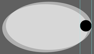
Fig 6.3 Construction of "comma"(process 1) (13/10/2021)
I used the basic shape of the "period" then placed 2 of the closed-counter part of the letter "o" to make the tail of the comma. I ensured the tail does not exceed the 55pt dimension trough the used of rulers as guides.

Fig 6.4 A close up of construction piecing(process 2) (13/10/2021)

Fig 6.5 Use of pathfinder tool to minus front(process 3) (13/10/2021)

Fig 6.6 Use of pathfinder tool again to minus out unwanted extra parts. It becomes clearer that it has taken the form of a comma.(process 4) (13/10/2021)

Fig 6.7 Final comma form after merging to one piece.(final process) (13/10/2021)

Fig 7. Guides & digitalised font design (13/10/2021)

Fig 7.1 All digitalised letters (13/10/2021)
Measurements
x-height - 500 pt
Ascender height - 745 pt
Descender height - -220 pt
Baseline to Centre height - 250 pt
Stem(all) - 55 pt width
Stem length of "d" & "b" - 745 pt height
Stem length of "p" - 720 pt height
Closed counter - 415 pt width 235 pt height
Crossbar of "e" - 55 pt width 500 pt height
Crossbar of "t" - 305 pt width 133 pt height
Apex of "t" - 200 pt height
Tail of "y" & "g" and terminal of "t" - 133 height
Tail of "y" - makes up of 1/4 of the stress of basic shape "o"
Tail of "g" - makes up of 1/2 of the stress of basic shape "o"
Finial of "e" & "g" - ends with 45 degree angle
Tittle of "i" "," "." - 55 pt X 55 pt
Exporting glyphs to Fontlab 7


Fig 8. 2 images above shows some of my 13 letterforms copy & pasted into Fontlab 7 for finalisation. (13/10/2021)
Letter Kerning Process

Fig 9. Set side bearings on both sides as 0 just as video demonstrated (13/10/2021)

Fig 9.1 Set side bearings as 50 (13/10/2021)

Fig 9.2 Before kerning letters p and y(individual kerning of a pair of letters) (13/10/2021)

Fig 9.3 After kerning letters p and y (13/10/2021)
Why have I used the individual kerning technique for p and y? This is due to the curvature of the "p" and angle of "y" which makes it look further apart when it actually has the same side bearings as the rest. To fix this. I made the bearings between the two letters as -30, as shown below.

Fig 9.4 Typeface kerned to -30 pt(Letters p & y) (13/10/2021)
It overall looks better and does not have that awkward spacing like before.

Fig 9.5 Initial completed FontLab 7 type formatting (13/10/2021)
Task 3A - Type Design & Communication

Fig 10. Task 3A - Type Design & Communication "Orbitual Regular" (13/10/2021)

Fig 10.1 Type Design & Communication "Orbitual Regular" JPEG (13/10/2021)
Revision after feedback(specified in Feedback section)
First was amended in Adobe Illustrator
What was amended?
- Tittle of "i", the round shape of the comma and the period was enlarged from 55 X 55pt to 100 X 100 pt
- the comma's tail was made to be more elongated/longer and larger.
- punctuation ! was added as I missed forgot to add that
- the crotch of "y" was made to be more curved rather than jagged to make it look uniform
- the open counters of "m", the curved inner parts were made to be smoother as it was initially more rough(harder edges)
- the tail of "g" was made to curve smoother as well. Also to make it look less rough.
- posters composition needs to be improved and must be done in A4. Font details must be in Helvetica 12 pts.
Red circles highlights the parts which were amended.

Fig 11. Amendment of tittle of "i" and inner open counter of "m" (20/10/2021)

Fig 11.1 Amendment of area below crotch of "y" (20/10/2021)

Fig 11.2 Amendment of inner tail "g" (20/10/2021)

Fig 11.3 Amendment of tittles and tail (20/10/2021)
2nd step was to complete amendment in FontLab 7

Fig 11.4 Close up of letters on FontLab 7 (20/10/2021)
Final Task 3A - Type Design & Communication
Font download -
https://drive.google.com/file/d/11g3BIjTg1NYy0CwoTLiOYnDj1Zl2Z0rH/view?usp=sharing

Fig 11.6 Final Task 3A - Type Design & Communication "Orbitual Regular" PDF (20/10/2021)
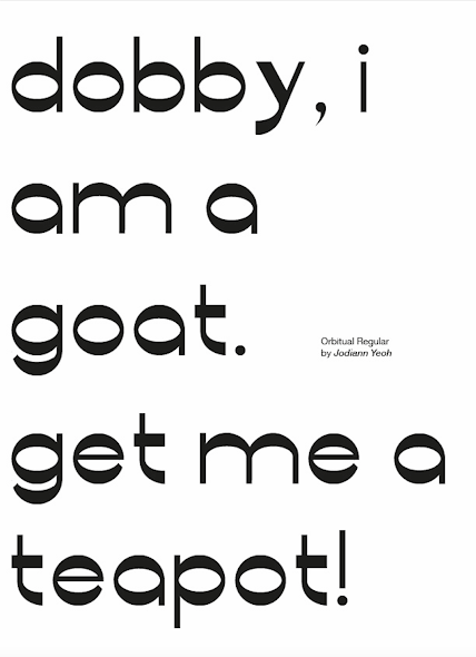
Fig 11.7 Final Task 3A - Type Design & Communication "Orbitual Regular" Poster JPEG (20/10/2021)
Fig 11.8 Final Task 3A - Type Design & Communication "Orbitual Regular" Poster PDF (20/10/2021)
FEEDBACK
Week 8(13/10/2021)
This week as supposed to be a mid-term break but he stated that it was optional to join an hour session of him reviewing our progress, which I attended for feedback. When I showed him my sketch, he said that my 3rd sketch's text form looks like it was done using a Flatbush, which is true visually. I then showed Mr. Vinod my digitisation of the 5th sketch(my initial final design but now is an exploration) and he stated that some aspects of the curvature was off and that my direction was not very clear. He stated that my idea is interesting but would need further experimenting and tweaking. He introduced me to the width tool which can be used as an easy way to start off a letterform. Furthermore, he gave me some sources to look for inspiration as well as a Netflix documentary called "Abstract", specifically second season last episode where Jonathan Hoffler gives tips related to this task.
We concluded that I should try out sketch 2 or 3(2 specifically) as there is a clearer form and direction.
Week 8(20/10/2021)
General feedback: very good typeface, excellent work, good decision making, he loves the flare of the "t"
Specific feedback: the "y" and "g" is challenging and theres some tweaking thats needed to smoothen the curvature of m, y, g so its not an abrupt transition. The tittle of the "i" needs to be bigger than the width of the stem, same for punctuations(3 to 4 times thicker), to compare with a similar typeface to gauge the size needed. The poster needs to be A4 and composition can be done better. Don't use any other typeface other than Helvetica 12 pts. After amendments are done, i should be good to go for submission.
Week 10
-
REFLECTION
Week 8(13/10/2021)
I agree with the feedback which was given to me as I also felt that it looked pretty unclear about the base shape that I was going for. I will be paying close attention to the feedback he has given and explore more with the 2nd/3rd sketch instead as it has a more definitive approach in its characteristics.
Week 10(20/10/2021)
This weeks feedback was positive, something that I don't usually get and that gave me a boost of confidence and something to be hopeful about in getting better compared to before. This exercise was challenging at the start but I've come to love and enjoy the learning process of exploring my options and analysing appropriately. I've learnt the importance of understanding and appreciating the time and skills needed to develop a typeface, not to mention the patience needed to amend the design when theres a mistake. All thanks to Mr. Vinod for his firm and effective guidance and Mr. Charles for his patience and constant affirmations.
Comments
Post a Comment