Typography Task 3B Exercise
Jodiann Yeoh Chooi Kit 0352238
Module : Typography
Task 3B : Type Design & Communication
LECTURE
Week 10(27/10/2021)
-Briefing on Task 3B
-We are given multiple greeting options to choose from.
INSTRUCTIONS
Specific things to note
- use one of 10 typefaces provided
- takes Technical and aesthetic expertise. Includes all of what we’ve
learned
- typographically social message or greeting that is relevant to the
taylors community/ society as a large
- save as PNG, PDF, upload to G-drive and embed into portfolio
- screen grab your phone with the sticker sent
- can use minimal colour
- will be used in selected platforms like telegram, WhatsApp
- must be attractive, functional and visually impactful sticker
- Use adobe illustrator and photoshop
- must animate the message
- must be 512px X 512px, 72 dpi
- send sticker PNG to telegrams @stickerator bot if have issues
Aspects to be considered and steps to note before starting
- visual research of stickers
- research on static stickers
- greeting via typographic expression
- type out the greeting using the 10 typefaces
-digitise
- determine colour, do not use the common swatches, use more interesting
colour(coolors.co
can also be used to create stickers)
- create a 3D effect or just make it interesting
-then animate
- do not go overboard on the colour usage(minimal)
- make border around sticker as guideline
What greeting have I chose?
I chose the "Happy Halloween" greeting as Halloween is nearing,
thus why I feel its suitable to pick this in light of the upcoming
celebration. Also, I had an idea for it at an instant, and felt drawn to
do this as opposed to the rest.
Visual Research/ Inspiration

Fig 1. Inspiration taken from Pinterest
This is minimalistic yet effective

Fig 1.1 Another inspiration taken from Pinterest
I really liked how the letterforms were made to look like the branches of
a dead tree, adding to the scary feeling. I also loved how the letter "O"
was made to look like a pumpkin jack. The use of contrast through the
pops of orange colour(the colour theme of halloween) in small but
decisive areas is visually appealing and makes it pop.
In-depth research on elements which will be added before
digitisation

Fig 2. Anatomy of Bat
Note
-Illustration of bat, spider, spiderweb will not be rich in detail and
colour but will have the basic, cute cartoonish form. This is because
viewers/ users will not be able to see the details as it is too small to
even see or appreciate.
-Minimalistic resemblance
-I will be replacing the "W" in Halloween with the illustrated bat which
can also be seen as flying mid-air(creative thinking)
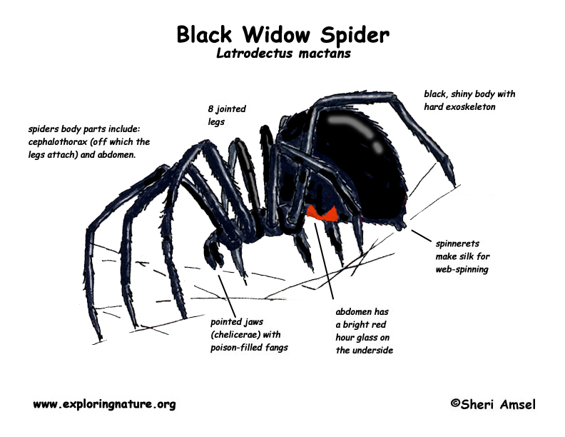
Fig 2.2 Image of Black Widow Spider
Fig 2.3 Anatomy and colour of Black Widow Spider
Features of Spider
-4 pairs of legs in total, thin
-legs are relatively longer than body
-Abdomen has the largest proportion compared to prosoma(the upper side of
the body segment
-has its infamous red hourglass shape on its abdomen
-has jaws with fangs which is used for protection and prey.
Fig 2.4 Inspiration of spider web form
The ends of the spiderwebs silken thread resembles the shape of the
expressive curvatures of Tim Burtons style in "The Night Before Christmas",
one of my favourite childhood animations. I feel that the shape add to its
eerie aura, which complements the main greeting I chose, which is "Happy
Halloween"
Fig 3. The possible font options that I liked out of the 10 given fonts. I ended
up sticking with Bodoni font.
Attempt 1
Digitisation Specifics
Dimensions - 512 X 512px
Font - Bodoni 72 Smallcaps Book
Font Size - 110pts (ensure it has space from artboard borders)
Fig 4. Digitisation of Idea Draft 1
Just some exploring before making it a final idea. Words happy and
Halloween were leaded to be closer to one another as the initial space
between the two was too far apart which made it look awkward. Uncoloured,
bat is not illustrated properly using open tool but instead using brush
tool. I didn't like how formal the typeface looked and how it looks
flat.
Fig 4.1 More exploration
This time I played around with the colour additions. I wanted the
colour to stick to the theme of Halloween, which is orange, black etc. The
two words are leaded closer to one another. Each letter was given
different baseline shifts to make it look as though it is dancing/
moving.
Fig 4.2 Final Digitisation
Fig 4.3 Use of pen tool to create stickers background shape then using
curvature tool to smoothen rough looking parts.
Fig 4.4 I searched for "Halloween Colour Themes" on Google
Fig 4.5 Coloured version of design 1
Fig 4.6 Coloured version of design 2
Fig 4.7 Coloured version of design 3
Fig 4.8 Creating the sticker pack in Telegram
I had to send PNG files to the sticker bot(@Stickers) and to follow
the guidance of the bot to add additional stickers into the pack. It
was hard to find a name or add an interesting name to the pack as the
bot would reject most of them, so I just named my pack
"Jodiann". I finalised the pack with the /publish command and the
sticker was available to be used.
The stickers sent in Telegram chat
After receiving feedback from Mr. Vinod about my initial design, he stated
that I should utilise and make most of the space provided (detailed
feedback below in "FEEDBACK" section). Hence why I will be re-doing the
design but keeping certain elements of my initial draft.
Attempt 2
Digitisation Specifics
Dimensions - 512 X 512px
Font - Bodoni STD Bold Condensed.
Font Size - "Happy"(132.51pt), "Halloween"(107.11pt)
Vertical scale of body text - 175%
Outline - 7 pt white outline
Fig 5. Black and white version of design
Fig 5.1Coloured version of design 1
Fig 5.2 Coloured version of design 2
Fig 5.3 Coloured version of design 3
Conclusion of digitisation
Out of the 3 colours, I lean more towards coloured version of
design 2 as it is a simple yet relevant colour palette. The other two
colours are too overwhelming to the eyes and some visual elements
like the spider webs and the spider becomes hard to see due to the
distracting colours. Note that I did not randomly choose
colours, I ensured that it sticks to the "halloween" theme, thus
the use of orange, purple, black, green and white. Moreover, I made
the spider webs thinner compared to the initial design as it may impair
and blend in with the stems of the typefaces, making it hard to read. I
also excluded the bat as if I were to vertically scale it, it would
look too distorted and would no longer resemble a bat, I also
excluded it because there would be too much visual elements.
I think this design is an improvement compared to the first attempt at it
looks more full and complete due to maximum utilisation of space. The
sticker does not have weird shapes protruding out awkwardly, but is
instead smooth and aesthetically pleasing. The shape and form of the
spider web is more realistic and has better movement/ flow as well as
variety compared to attempt one, making the design look better as a
whole.
After feedback(specified in week 12 feedback section), I had to make some minor changes to the current design. Here are the changes.
Fig 6. Amended B&W version(PNG)
Fig 6.1 Amended Coloured version 1(PNG)
Fig 6.2 Amended Coloured version 2(PNG)
Fig 6.3 Amended Coloured version 1(PNG)
Fig 6.4 Amended B&W version PDF
Fig 6.5 Amended coloured version 2 PDF
Changes made in amended versions
- duplicating typefaces happy halloween and making it a lighter colour in the back to give it a "3D" effect and overall enhances the look of the design.
- addition of Taylor's logo as per requested.
Making of telegram sticker pack
Fig 7. Sending PNG's and selecting name, and emojis associated to design & theme
Fig 7.1 Final visual outcome of sent stickers in chatbox
Link of sticker pack in telegram - https://t.me/addstickers/spookness
Animation process of design

Fig 8. Research on basic animation example 1 from Google
Fig 8.1 Research on basic animation example 2(Slightly more complex) from Google
Fig 8.2 Research on spider movement from Google
Fig 8.3 Research on Black Widow spider leg movement from Google
Movement info from observation
-Joints of legs move at random, very quick and abrupt
Fig 9. Changing position of legs of spider in each frame.
Fig 9.1 Use of artboards in illustrator to create each individual frame of animation.
The method is the same as animation of type expression from previous task, which I then applied here. I then imported the artboards to photoshop.
Fig 9.2 Creation of frame animation in Photoshop
Fig 10. Animation attempt 1 on photoshop(PDF)
I felt that the loop of lamination attempt 1 wasn't smooth enough as when the spider went fully down, it popped back up. So to make it smoother, I recycled the frames to make it look like its reversing back up and moving back down. The total duration is 3 seconds long.
Fig 10.1 Animation attempt 2 on photoshop(PDF of Final Design)
Fig 10.1 Animation attempt 2 on photoshop(GIF of Final Design)
Animation specifics
- 22 frames in total
- start and end frame is 0.5 seconds, everything else in the middle is set to 0.1 seconds(perfect length of 3 seconds)
Incase you missed out on the sticker pack link above
- https://t.me/addstickers/spookness
FEEDBACK
Week 11(3/11/2021)
- That I should maximise my use of space provided eg. making the typeface larger, choosing a condensed font style. Mr. Vinod also pointed out that I should reduce the visual elements as theres too much eg. the bat and the spider and that I should remove one. Lastly, I should add in more spider webs to again make use of the empty spaces.
Week 12(10/11/2021)
- The design is great and effective, but should add more dimension to it to
make it pop out more. Mr. Vinod suggested duplicating the typeface and
making the front part darker and the back lighter. He said that he liked the
purple colour and that I should add the taylors logo in.
REFLECTION(16/11/2021)
Out of the other tasks, I felt that this task was slightly easier and more fun to do. When I say slightly easier, I definitely still struggled with this task. I had troubles finding ways to utilise the space and thats where suggestions and feedback from Mr. Vinod came in handy as I was struck. I eventually adapted my design and made a design which catered to maximising the space given as well as was a great improvement from the initial design. It looks more complete and gives off a spooky vibe. It doesn't look as messy and disoriented as the first design.
The animation was a rollercoaster as when I tried in After Effects, it just wouldn't cooperate, thus why I stuck to the original method which was taught before, using artboards then animating it in photoshop. I felt that it went smoother and the outcome was successful.
Something I realised about myself was that I tend to be very stubborn when it comes to the design idea, whereby I would tend to stick with it. But after learning that letting go and trying again with a clean slate is so much more gratifying and the outcome is way better than it was, almost unrecognisable which I am proud of myself for.


Comments
Post a Comment