Advanced Typography
1/4/2022 - /4/2022
Jodiann Yeoh Chooi Kit 0352238
Advanced Typography || Task 1 : Exercises 1 & 2
Lectures
Week 1 - Lecture 1
Advanced Typography - Typographic Systems
Typographic systems are collections of individual styles used
across an application.
Shape Grammar
Set of shape that apply in a step-by-step way to generate a
set, or language, of designs. It provides a sense of purpose
that focuses & directs the decision making.
There are 8 major variations as follows :
- Axial
- Radial
- Dilatational
- Random
- Grid
- Modular
- Transitional
- Bilateral
Axial System
All elements in a design are organised to the left or right of a
single axis. It organises text well in the same degree and are
placed in a block shape. It helps the poster look more
"mechanical".
Radial System
All elements are extended from a point of focus.
Dilatational System
All elements expand from a central point in a circular
fashion.
Random System
Elements appear to have no specific pattern or relationship.
Grid System
A system of vertical & horizontal divisions. Consists
of different sizes and weights to create hierarchy.
Transitional System
An informal system of layered bandings.
Modular System
A series of non-objective elements that are constructed in as a
standardised units.
Bilateral System
All text are arranged symmetrically on a single axis.
Week 2 - Lecture 2
Advanced Typography - Typographic Composition
Principles of Design Composition : Dominant
principles underpinning design composition, which are emphasis,
isolation, repetition, symmetry and asymmetry, alignment,
perspective etc. However ambiguous.

Fig 2. Principles of Design - emphasis
The Rule of Thirds : A photographic guide to composition, a
frame can be divided into 3 rows and columns. The intersecting
lines are used as a guide to place the points of interest, within
the given space.

Fig 2.1 The Rule of Thirds
Environmental Grid : Based on the exploration of an
existing structure or numerous structures combined. It includes
non objective elements to create a unique and exciting mixture of
texture and visual stimuli.

Fig 2.2 Environmental Grid, Typographic Design - Form &
Communication
Form & Movement : Based on the exploration of an
existing Grid Systems. The placement of form on pages create
movement. It is a form that constitutes the placement of image,
text & colour.

Fig 2.3 Form & Movement
Week 3 - Lecture 3
Advanced Typography - Context & Creativity
The first mechanically produced letterforms were designed directly to imitate handwritings. It became the basis or standard for form. The hand drawn shape and forms are influenced by tools such as bones, plant stems, sticks. And material such as clay, papyrus, animal skin etc.

Cuneiform c. 3000 B.C.E.
The earliest system of actual writing, evolved from pictograms(written from left to right)

Hieroglyphs
-Ideograms presents the things they actually depict.
-As determinatives to show that the signs proceedings are meant as phonograms and indicate the general idea of the word.
-As phonograms to represent sounds that "spell out" the individual words.
Early greek (5th C. B.C.E.): Drawn freehand, not constructed with compasses and rules, and they had no serifs. In time the strokes of these letters grew thicker, the aperture lessened, and serifs appeared.
Roman Uncials: By the 4th century Roman letters were becoming more rounded, the curved form allowed for fewer strokes and could be written faster.
English Half Uncials (8th C.): In England, the uncial evolved into a more slanted and condensed form.
Carolingian Minuscule: Capitals at the start of a sentence, spaces between words and punctuation. It was this style that became the pattern for the Humanistic writing of the fifteenth century; this latter, in turn, was the basis of our lower-case roman type.
Black Letter (12-15 C. CE): Characterised by tight spacing and condensed lettering. Evenly spaced verticals dominated the letterform. Condensing line spacing and letter spacing reduced the amount of costly materials in book production.
The Italian Renaissance: Newly rediscovered letterforms Antica. The renaissance analysis of form that was being applied to art and architecture was directed toward letterform — resulting in a more perfect or rationalised letter.
Week 4 - Lecture 4
Advanced Typography - Designing Type
Type Design Process
1. Research
- Understand type history, type anatomy, type conventions and terminologies.
- Determine the type’s purpose or what it would be used for and what different applications it will be used in.
- Study existing fonts that are presently being used for inspiration/ideas/reference/context/usage pattern/etc.
2. Sketching: Traditional/digital
3. Digitisation
Professional softwares: FontLab and Glyphs App. Some designers also use Adobe Illustrator then only the specialised font apps. This however is frowned upon by the purist.
4. Testing
The results of testing are part of the process of refining and correcting aspects of the typeface. Prototyping is also part of the testing process and leads to important feedback. Depending on the typeface category (display type/text type) the readability and legibility of the typeface becomes an important consideration. However, it is not as crucial if the typeface is a display type, where expression of the form takes a little more precedence.
5. Deploy
Even after deploying a completed typeface there are always teething problems that did not come to the fore during the prototyping and testing phases. Thus, the task of revision doesn’t end upon deployment. The rigour of the testing is important so that the teething issues remain minor.
6. Typeface Construction
Using grids (with circular forms) can facilitate the construction of letterforms and is a possible method to build/create/design your letterform.
7. Construction and considerations
Different forms and constructions must be taken into account when designing a new type. An important visual correction is the extrusion of curved (and protruding) forms past the baseline and cap line (overshoot). This also applies to vertical alignment between curved and straight forms.
Fitting the type: A visual correction is also needed for the distance between letters. The letters must be altered to a uniform visual white space - the white space between the letters should appear the same.
Instructions
Task 1 : Exercise 1 - Typographic Systems
This exercise required us to design and explore the 8 typographic
systems being axial, radial, random, grid, dilatational, bilateral,
modular and transitional. Before attempting to do so, I watched the
lecture video which demonstrated how to use indesign appropriately.
This helped me refresh my memory as I may have forgotten what I've
learnt the previous semester.
Note prior to exploration
-Do not include too much graphical elements
-200 X 200mm sizing
-No excessive colour usage


Final Radial System JPG

Final Random System JPG

Final Modular System JPG

Final Dilatational System JPG

Final Bilateral System JPG

Final Grid System JPG

Final Transitional System JPG
Final Task : 1 Exercise 1 - Typographic Systems Grids & Guides
PDF Week 2
Final Task : 1 Exercise 1 - Typographic Systems PDF Week 2
Task 1: Exercise 2 - Type & Play
Part 1 : Finding Type
As for this exercise, we were tasked to pick a subject to analyse,
dissect and identify potential letterforms.
Notes
- Height of dartboard should be 1000pts
- 4 letters only
- Uppercase or lowercase
- Reference from the 10 provided typefaces
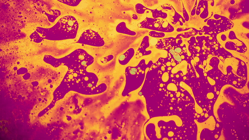
Subject of Choice - Chemical spill
The image was taken from google. I felt that my subject of choice
would have potential for exploration due to its interesting random
fluid movements. I liked how "flowy" and mesmerising it looked and
so I felt it could be reflected through the letterforms that I
will be attempting to create. I of course took a long look at the
image before deciding on whether I can dissect some shapes which
resembled letters. I managed to find letters F, L, O, W.

Traced letters
Before tracing, I took a long stare at this image to identify and
reevaluate the potential letters I want. After doing so, I traced
them out. Image was traced out on Autodesk Sketchbook.

Traced letters, but filled in
I filled it in so I would get a better grasp of how the letters
would turn out.
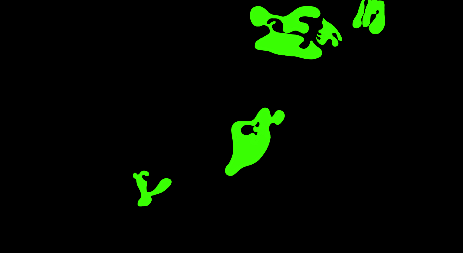
Clearer outline excluding reference image(F, L, O, W)
I removed the background and added a black background to make the
identified letters legible. It looks wonky but I'm trusting the
process.

Raw Extracted Letterforms

Vectorised Letterforms(Illustrator)
Though letterforms are somewhat legible, it still was not obvious
enough that it spelled out "Flow".
Before proceeding with anything, I did further research on the
subject. I looked through pictures on liquid/ fluid movements like
chemical reactions, psychedelic liquids, lava lamp liquid etc.
This would aid my understanding prior to attempting to create the
letterforms itself. Making the letterforms resemble a chemical
spill is crucial.
Ideation of letterforms(Sketch)
I wanted to have a direction and I felt that sketching was a good
way to work up some ideas on what I want my final letterforms to
look like. By doing this, I helped me develop progressive
consistency in my letterforms with each attempt. I looked at the
features which I want to maintain in the original letterform like
the curvatures and the contrast between thick & thin strokes
which gives off a liquid and organic-like form.
Typeface Reference

Initial Reference - Univers LT STD 63 Bold Extended
The reasoning behind this being the initial chosen typeface
reference is due to its "squashed" nature. Its width holds
resemblance to my raw extracted letterforms.

Actual Reference - Allotropic by The Flying Type
After feedback, I chose to Allotropic by The Flying Type. It holds
more likeness to my extracted letterforms and has elements which I
want to incorporate in my final design. The thinness of certain
areas in each stroke in contrast with curvatures and thickness of
the ends of the letters, reminded me of liquid prior to spilling
apart.
Further Exploration
Further exploration is based on the sketches I've done previously.

Evolution 2
I removed some awkward looking parts from the vectorised raw
letterforms which made it initially look confusing. Now it's more
readable as "Flow".

Evolution 3
I wanted to introduce more consistency in terms of curvature and
form of the letterforms. The letterforms are made to look more
"fluid" and smooth, matching more of the liquid of oil/ a chemical
spill.

Final Type Design
I wanted to emphasise more on the thinness of the letter strokes,
moving into the thickness of the ending "blobs". As said before, I
want it to look like the liquid is in the midst of separating,
like natural oils do. I also did further refining of each letter
to ensure it keeps its original form whilst having obvious and
better changes.

Compiled Process(Attempt 1)

Initial Final Letter "F"

Initial Final Letter "L"

Initial Final Letter "O"

Initial Final Letter "W"

Initial Final Type Design
Initial Final Finding Type PDF
After receiving week 4 feedback(details in feedback section), I reattempted to revise my work.

Final Compiled Process

Final Letter "F"

Final Letter "L"

Final Letter "O"

Final Letter "W"
Final Finding Type PDF
Part 2 : Type & Image
As for Part 2, we were tasked to choose an image and to incorporate a text/ sentence which relates to the image of choice. The objective is to enhance/support the interplay between the letter/word/sentence and the selected visual. The text must be woven into a symbiotic relationship with the image.
Inspiration

Inspiration 1 - Sourced from Pinterest

Inspiration 2 - Sourced from Pinterest

Inspiration 3 - Sourced from Pinterest
I liked how dynamic the models poses were in the images and how the text overlaps with the subject(model) making it look like its moving and makes the overall composition look interesting.
Attempts

Image sourced from Pinterest

Attempt 1 - "DANCE"
The font ITC New Baskerville STD Roman was used. I liked how it looked but I was not entirely satisfied as I did not feel the words have enhanced the image nor convey the intended message.

Image sourced from Pinterest

Final Type & Image - "DROWN"
The font used for this image is Futura Medium. I wanted to keep the font simple as I did not want to take too much away from the main subject which is the model herself. I chose the word "DROWN" as I wanted to evoke the feeling of heaviness and loss of breath to the viewers. This is further emphasised through the words weighing down on the model, giving the impression that she is being drowned by the text itself. I used the same technique from the inspired images through the overlapping of text. I'm happy with how it turned out.
Week 2
General Feedback - Well Done.
Specific Feedback - For the axial system, theres a lot of graphical
elements but oddly enough it works well.The information is well
arranged and you can see and you can see the little details in each
system. Overall did a good job on the 8 systems.
Week 3
General Feedback - It's coming along, keep developing.
Specific Feedback - Search for Google/ display font and look at the
curved edges of the typeface. At least then I'd have some sort of
typeface reference.


What I've Learnt
Week 4
General Feedback - Mr. Vinod pointed out that he thought that the thicker letters looked better(From Evolution 2) and to adjust some minor things.
Specific Feedback - He pointed out that it would look better if I kept to my 3rd progress of letters "O" and "W", to make the top of the "L" less heavy so it wont resemble a "C" and to take aspects from my 2nd progress of letter "F".
Week 5
General Feedback - Both are good.
Specific Feedback - Both of them are good, pick either one.
Reflection
Experience - I actually enjoyed all the exercises. Especially Part 1 of type and play where we were given the freedom to choose a subject that we want and to dissect it. It was challenging but it helped me look at everything around me differently.
Observation -The observation in which I have made when doing the exercises was that balance and consistency are so important and is what makes a good outcome.
Findings - I found it particularly challenging to do Exercise 1 not because it was hard but because it pushed me to do things which I am not comfortable with such as the random system. Regardless, it was a good way to step out of what I'm used to.
Further Reading
This e-book helped clarify some confusion which I had when applying the systems.

7 Essential Typographic Layout Systems
7 Essential Typographic Layout Systems by Lucas Czarnecki
Reference - https://type365.com/2017/02/21/7-typographic-layout-systems/
Modular Systems
I found myself initially being stuck on understanding the difference between grid and modular systems so I looked into how to apply the two different systems on its own.

Modular Systems
What I've learnt
- You do not have to adhere to grids.
- Use of repetitive structures to break up contents.
- Content can be placed into a range of structures which are made out of shapes such as squares, circles, pretty much anything.
Grid Systems
I then looked into grid systems to differentiate it compared to modular systems.

Grid Systems
- Divide it into rows and columns.
- create various visual fields, which can be combined to make up the composition.
- Ensure text and graphics do not spill into the spaces between the visual fields.
Comments
Post a Comment