Advanced Typography
3/6/2022 - 1/7/2022
Jodiann Yeoh Chooi Kit 0352238
Advanced Typography || Task 3 : Type Exploration &
Application
Instructions
Fig 1. Advanced Typography MIB
Lectures
Week 10 - Task 3
Advanced Typography - Type Exploration & Application
As for task 3 Develop a font that is intended to solve a larger problem
or meant to be part of a solution in the area of your interest be
it graphic design, animation, new media or entertainment
design or any other related area not necessarily reflecting
your specialisation.
1. Research, Ideation & Sketches
Proposal of 3 ideas
Fig 2. Initial Proposal
Fig 2.1 Revised Proposal
The first idea is what I chose to move forward with as I felt it was more interesting. I also thought of my end outcome and what I wanted for it to be.
My vision when listening to the song


Fig 3. Inside of Kaleidoscope
I felt like I was in a kaleidoscope where I could feel every fractal of
shapes being shifted while an array of colours flashes before me.
What I want to take from this vision are the geometric shapes,
consistent and systematic. Elements which makes a good typeface.
Inspiration

Fig 3.1 Traditional Greek tiles
As I thought more about the form of my potential typeface, Greek tiles came to mind due to its structural nature and how it resembled the movement within a kaleidoscope as it shifts.

Fig 3.2 Typeface by Jean-Claude Chianale
Fig 4. Typeface sketch
Elements are taken from the kaleidoscope, evidently shown through the use of consistent geometric shapes of both curved and rough edges. I first sketched out ideas of how each letters would look like to get an idea of the placements and to ensure the style is reflected throughout each letters.
2. Digitisation

Fig 5. Step 1 - Base shapes/guides
My form of my typeface is made up of 4 rows and 5 columns of circles. I took inspiration from Jean-Claude's method where she laid out these circles and build upon that. I felt that some letters of her typeface did not resemble the letter which she intended to create, reflected through the lack of resemblance to the original letters. Thus why instead of taking from her use of 4 rows and 4 columns, I've decided to add one more column as I felt that a typeface naturally would have a longer height compared to its width. I also felt that it would give me more control.

Fig 5.1 Step 2 - Laying out the form of the letter

Fig 5.2 Step 3 - Adding in the the details

Fig 5.3 Laying out form then details of each letter
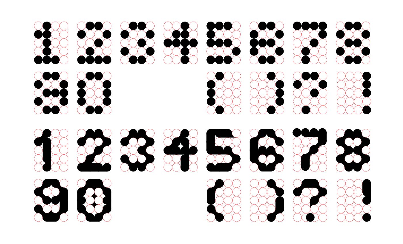
Fig 5.4 Creation of numbers

Fig 5.5 Final uppercase letters, numbers, & special characters
3. Stop Motion Animation
To give an idea of what I intend to do, I want to create a type display using stop motion animation(specifically claymation and paper animation). I found this final task to be an opportunity to do showcase what I enjoy and what I am best at, which is ultimately working entirely with my hands to create art.
As for the animation itself, the style I'm going for is something weird, resonating with the song which was touched earlier on, "I Am The Walrus" by The Beatles. I will only be displaying the letters(Big letters) as stop motion takes a tremendous amount of time.
Materials
- Wire
- Blade
- Scissors
- Uhu glue
- Modelling clay
- Aluminium foil
- Clay shaping/sculpting tools
- Printed letters
- Phone camera and Stop Motion application
- 2 lamps
- Tripod stands

Fig 6. Sculpting basic form of hands
I used aluminium to replicate the thickness of the palm. I did not use modelling clay for its entirety as it would only add weight to it and would make the animation process more difficult(risk of it dropping during the frames). For the fingers, I used wire to act as the bones. This would prevent the fingers from "drooping" down, possibly ruining the animation during the filming. I then used modelling clay to wrap around the aluminium & wires to create the skin. It sort of felt like I was decorating cake as it was like placing fondant on the cake then moulding it to the shape I desire.

Fig 6.1 Adding in details
I love realism and I want that to be reflected in what I create. So I made sure the hand was somewhat anatomically correct to resemble an actual hand. I added wrinkles and creases, finger nails, muscles, bones and tendons. I was pretty happy with how it turned out.

Fig 6.2 Finished hands

Fig 6.3 Sculpted eye
I forgot to take pictures the eye before filming so this is a picture after its been through a lot XD. I used aluminium for the basic shape of the eye as well then did the detailing with modelling clay.

Fig 6.4 Printed letters
Since I don't have a printer in my apartment, I had to go to campus to get these printed in A4.
I then individually cut out each letter, which was such a pain. There were times where I accidentally cut off parts which weren't supposed to be cut off, but thankfully I printed duplicates(knowing my clumsy self).
Animation idea
- The hand spins and showcases each letter. At the end, an eye appears, it blinks, then disappears.
Notes prior to animating
- Make sure to take more frames and make the slightest movement change for each shot to ensure that I get the smoothest result.
- Each letter gets spun 180 degrees then when it is off the view, place the next letter, then the next, and the process repeats itself.

Fig 6.5 Frames
I decided that it would be easier to use my phone to do the stop motion itself so I purchased an app called "Stop Motion". I took a total of 571 frames, and set it as 13fps. The video ended up being 45 seconds.
The apps features were really useful as there was this grid feature which helped me make sure everything was aligned and centred. There was this other feature where I could see the frame I had taken prior compared to what my camera sees in front of me. This acts as a reference to ensure I'm not moving the object too fast to the point where the movements become too abrupt. Also, all camera settings were done manually as setting it to auto would lead to inconsistencies with the image lighting and quality.
Problems
- The hand kept falling down due to it curved nature of the base. So I had to extend the wrist to act as a support base. That fixed the problem.
- The mat kept moving so I had to re-adjust it at times. I had to make sure it was at the exact same spot as before so that there wouldn't be any unwanted changes.
- The eye kept falling down as it had no support other than sticking to the hand so I had to take the shots really quickly before it falls while making sure it comes out smooth.
- I kept banging into the camera or tripod which misaligned the camera, so I had to take time to realign it.

Fig 6.7 Initial final type application - Font display
After receiving feedback for week 13, I had to do the stop motion again but this time with more emphasis on the type design. Also, make the overall composition more interesting instead of repetitive like the rotating hand. My idea was to make the type move in a systematic but random manner by making it shift to the left, gradually moving out of frame. I then made all the type cut-outs come together and finally disperse.
Fig 6.8 Final type application - Font display
I made the stop motion more visually engaging through the random movements of the typeface. The randomness made it less repetitive compared to the last one where it was just constantly rotating.

Fig 6.9 Aftermath of stop motion filming
During feedback, Mr. Vinod advised me to create lowercase letters aswell as its a good font and might as well do it since its the final project. So on the day itself I started to work on the lowercase letters.
4. Lowercase letters

Fig 7. Creation process of lowercase letters
The lowercase letters were harder to create compared to the uppercase letters as for this one, I had to tweak the dimensions(the amount of circles) used depending on the letter. The width and height are not as consistent as the uppercase letters so I had to adjust it to fit the original letterforms of lowercase letters.
Struggling with certain letters

Fig 7.1 Creation of letter "s" progress 1


Creating the lowercase letter "s" was tough. It was either it looked exactly like an uppercase letter "S" or play around with it more. I eventually ended up with the one above where I had to tilt it to make it somewhat smaller.

I created the one on the left first and felt that it was disproportionately large compared to the rest of the letters which made it look awkward. So I tried to make a smaller one and ended up with the one on the right which I'm pretty satisfied with.

Fig 7.5 Final lowercase letters
After digitising all the letters, numbers, and special characters, I proceeded with developing the font. Here is where I ran into troubles. The font generating apps were all expired in subscription or was not able to be run on Mac. I messaged Mr. Vinod about it and he suggested that I use the computers in the Mac Lab to generate my font in FontLab7.
I went to campus and attempted to do so. I won't lie, I was about to give up because I forgot how to do it all, however I went back and looked at the typography lecture on FontLab7 and was finally able to generate it fortunately.

5. Final Type Exploration & Application

Fig 9. "Walrus Regular" - Final type design JPG
Fig 9.1 "Walrus Regular" - Final type design PDF
Fig 9.2 Initial final type application - Stop motion animation type display
Fig 9.3 Final amended type application - Stop motion animation type display
Feedback
Week 10
General Feedback - Proceed with the first idea
Specific Feedback - Make sure its application matches up with its intended idea.
Week 11
General Feedback - Continue working
Specific Feedback - The typeface looks good and consistent, however I need to work faster.
Week 12
General Feedback - The typeface is consistent
Specific Feedback - The typeface is very well done. Also, try to create the lowercase letters after the application then generate the font.
Week 13
General Feedback - Good job on creating the lowercase letters aswell.
Specific Feedback - Make sure the lowercase letters thickness is the same as the uppercase letters. Also, the animation is good but too repetitive and the focus is not on the typeface. Mr. Vinod sent me examples and advised me to try again.
Reflection
This task was challenging but the most enjoyable out of all the tasks. I was able to acquire new skills whilst maintaining motivation and enjoyment when carrying out this task. I now have a newfound love for stop motion animation. A skill which I might use in the future if I were to dive into that area in the art world.
For this task, I had to do a lot of resourcing for materials and running up and down to campus so that I can get things printed and my typeface developed. It took a toll on me mentally when I had to redo the stop motion animation but it was worth it. Moreover, I had to do a lot more than I intended to as Mr. Vinod pushed me to do more. That I am grateful for as I would not have went through a "good" struggle without him.
Further Reading
As this is my first time attempting stop motion animation, I had to do some research in regards to the setup as well as the fundamentals on how to move the subjects to make it come to life.


Fig 10. How to make a stop motion animation by MasterClass
Link to further reading - https://www.masterclass.com/articles/how-to-make-your-own-stop-motion-animation#how-to-make-a-stop-motion-animation
How it was applied in my work
- Instead of 12 fps(which the website advised to use), I used 13 fps which means more frames had to be taken, but as a result the video was smoother and more liquid which I was pleased with.
- I moved my subject in the slightest way possible for each frame. If I did not do so, the movement would look too abrupt.
Aside from reading, I realised the most effective way to learn was to watch tutorials on how to create stop motion animation.
Fig 10.1 Claymation basics | Stop Motion by Howcast
It helped me understand the basics of how to move the clay and how you can also shape it in any way you desire.
Comments
Post a Comment